
Compress and release: Tunnel House
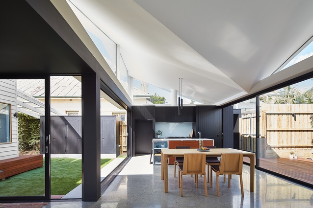
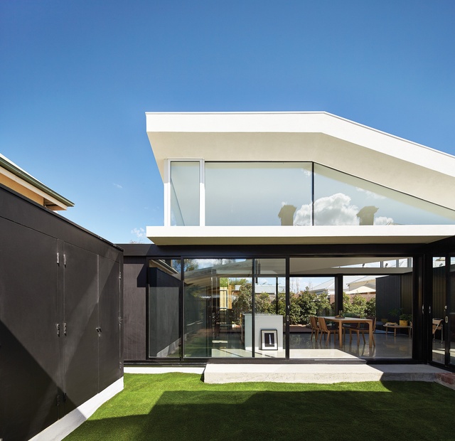
The ceiling angles down into an asymmetrical butterfly shape, adding theatricality and drawing the eye upward.
The house has been deliberately positioned in the garden, which is uncommon for homes in the suburb.

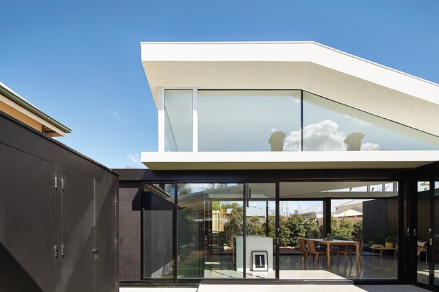
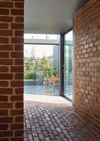
A heavily textured brick “tunnel” connects old and new; entering the bright new space from here makes for a grand reveal.
The modestly sized extension was conceptualized as a pavilion; it reads as a glass box, open to the outdoors.
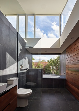
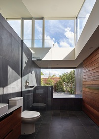
The light-filled “hidden” bathroom is part sanctuary, part showroom.

Black cladding lines each end of the pavilion, behind the kitchen at one end and with a quiet reading spot at the other.
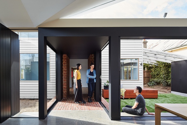
The compressed volume and black-coloured ceiling of the “tunnel” facilitate a cooling effect.
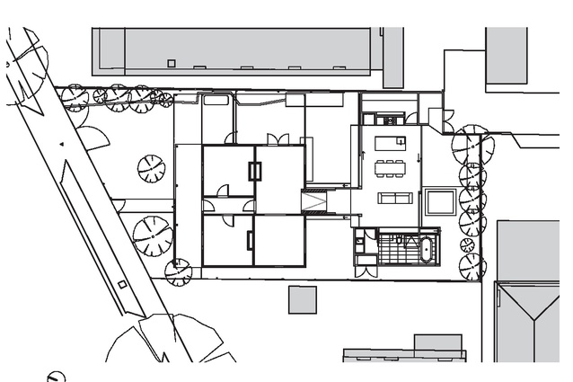
Plans of the Tunnel House.
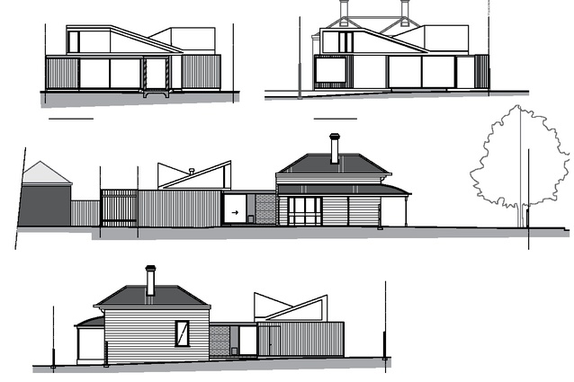
Tunnel House elevations.
In replacing an old lean-to with a clever garden pavilion, the architect has honoured the owners’ love for the outdoors as well as the environmentally conscious approach he has long championed.
Michael Ong only established his practice three years ago, but the Melbourne-based architect had already built up a respectable portfolio working for Andrew Maynard Architects, most notably on House House. The project, now four years old, is memorable for the black house graphic on its car-park-facing exterior wall. However, the design’s real accomplishment can be found in its clever passive heating and cooling system – something Michael continues to address and refine within his own practice, Michael Ong Design Office (MODO).
His recently completed extension to a cottage in Melbourne’s Hawthorn further develops the environmentally conscious approach Michael has long championed. Clients Sally and Leanne came to the sole practitioner with a brief to redo their kitchen, dining room, laundry and bathroom. These spaces were housed in an old lean-to that, without question, had to go. As Michael explains, “The back of the house just didn’t seem to work for them; it was a really awkward space, especially the way it connected to the garden.” It was very clear to him early on that the couple lived outside as much as possible and this informed his design decisions.
Instead of looking at what the internal living space should offer, Michael firstly looked at how best to address the garden. It involved thinking about the spaces between the buildings and how they could set out the design’s direction in terms of spatial planning. “That’s why I proposed a floor plan that was broken away from the existing house with a tunnel, or bridge, between the two,” he says. The resulting voids on either side of the tunnel, especially the generously sized courtyard on the eastern side, deliberately position the house in the garden (an uncommon configuration for a suburb like Hawthorn, where homes are typically built up to the side boundaries).
The tunnel, however, establishes the link between old and new, expressing the relationship by acknowledging the stark contrast between existing house and modern extension. Nothing is hidden here, but most importantly its compressed volume and black-coloured ceiling facilitate a cooling effect that is most welcome during the summer months. The double-brick walls (built from pavers salvaged from the site) are also insulated at the core, so they don’t trap the heat.
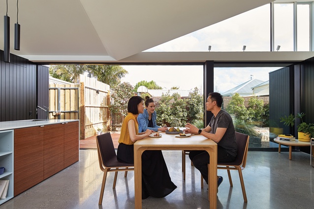
Entering the bright new space from the heavily textured, dark tunnel makes for a grand reveal, with the eastern courtyard a bonus unexpected surprise. Michael’s commitment to using every inch of interstitial space has resulted in an outdoor area suitable for use as a private retreat or for socializing, and its role as a direct source of light and air makes it crucial to the overall scheme. To take full advantage of this feature, the architect conceptualized the modestly sized extension as a pavilion, rather than an addition. It reads as a glass box, with floor and ceiling planes connected by vertical steel structure that support glass sliding doors at the northern and southern sides.
North-facing glazing opens onto the courtyard, a simple yet effective way to heat the open-plan kitchen and living area during winter, while a decent-sized eave minimizes any harsh summer light. When the doors are open the boundary between inside and outside is blurred, allowing the clients to completely embrace their preference for outdoor living. A new timber bench along the rear of the original house enables personal connection between all zones. “I also didn’t want to lose that space as an edge,” Michael says. “It was important to understand what the open areas are doing, but also important to see how they can work with the existing house.”
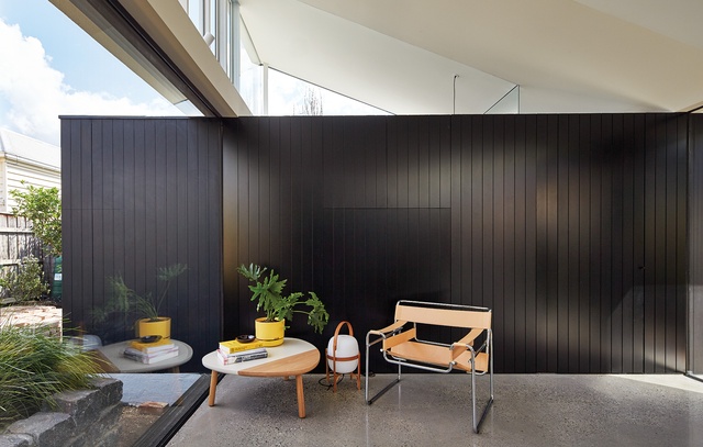
The juxtaposition of old and new is balanced conceptually by two black boxes – a storage unit in the courtyard and the kitchen cabinetry, incorporating a walk-in pantry. Michael has cunningly matched the cladding’s aesthetic throughout, reiterating the inside/outside theme. But, without doubt, the extension’s most dynamic design expression can be found in the treatment of the roof and ceiling. As Michael explains, “I wanted to maximize light coming into the pavilion, so I kicked up the roof on both north and south sides to capture that light.” The resulting rows of clerestory windows lend the exterior strong visual interest, while diagonal sections of motorized awnings facilitate cross-ventilation.
This passive cooling system negates the need for airconditioning – something the clients were very happy about – because Michael has essentially created a building that can be very flexible with its skin. In the kitchen and living areas the ceiling angles down into an asymmetrical butterfly roof, in a formal gesture that is precise in execution and dynamic in appearance. “It is unusual,” he says. “But what it actually does is act as a lamp diffuser, bringing the light down into the space from above.” Discreet uplights also bounce light off the ceiling, further illuminating the space.
The white butterfly roof offers a sense of theatricality that draws the eye up and away from the polished concrete floor. However, this dramatic feature is moderated with a second black box – this one at the western end opposite the kitchen, giving the space an elegantly restrained symmetry. It provides storage, accommodates the laundry and, in what is the extension’s other grand reveal, boasts a hidden bathroom that is part sanctuary, part showroom. For Michael, it was all about trying to get the building to work right, which he has achieved through a considered approach to environmentally responsive design and intelligent planning.


