-

Global Emissions
-

Demographic Indicators and Emissions through Time
-

CO2 Emissions for Top 15 Highest Emitting Countries over Time
-

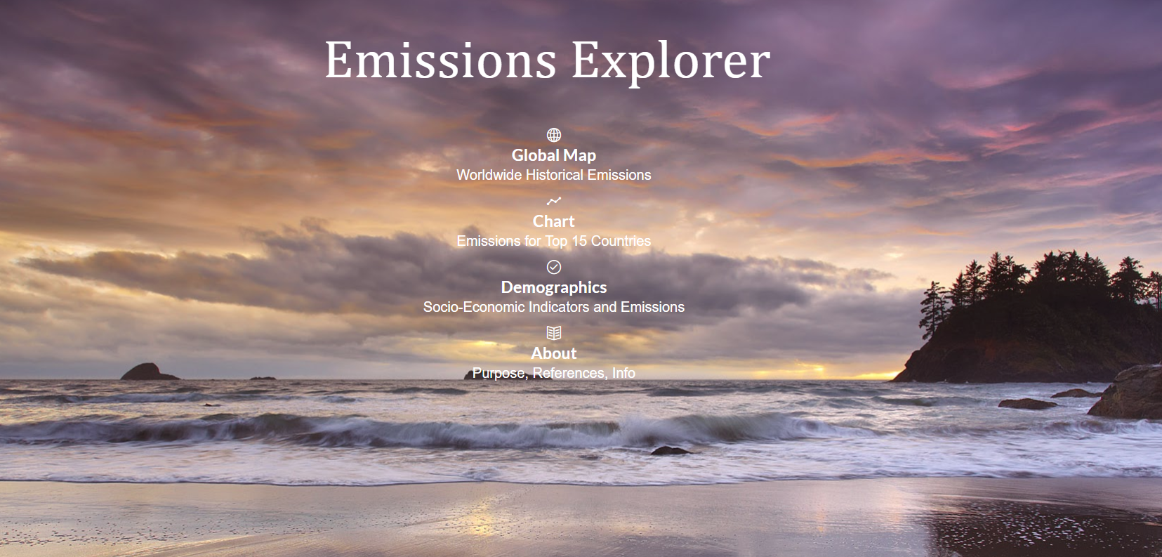
Landing Page
-

About Page

Interactive Data Visualization of Global CO2 Emissions
(Only tested on Chrome browser on desktop!)
Motivation
The Emissions Explorer is an interactive application designed to illustrate the potential of data visualization to derive knowledge from data. Everyone - corporations, governments, individuals - has data, but very few people know what to do with it. All these numbers contain useful information that can improve lives but often it is inaccessible. One issue is that most often the data looks like this:
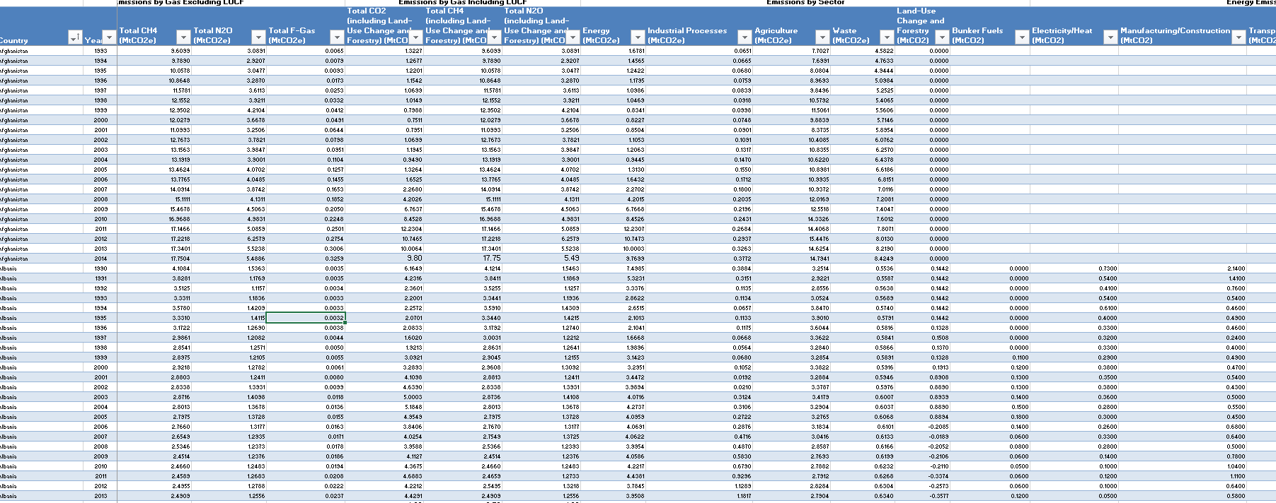
Endless spreadsheet rows full of numbers with no meaning in their current form. There is nothing wrong with spreadsheets, and as a data scientist, I spend much of time my time working with and extracting data from them. However, they don't really speak to people and it's difficult to convince someone to take action based on those rows and columns. The cliche is that a picture is worth 1000 words and the data version is that a good visualization is worth millions of individual numbers. My objective with the emissions explorer is to take publically available data that currently is hidden in spreadsheets and make it widely accessible. By using free tools - with plenty of resources for learning online - we can take these meaningless figures and turn them into useful knowledge through effective visualizations.
Features
The Emissions Explorer has 3 main parts:
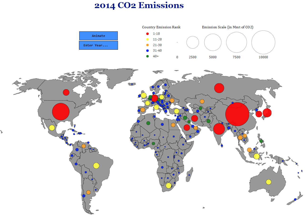
- Global Map: Displays historical emissions of all countries with available data on a world map. Circles on the country are sized according to the amount of CO2 emitted and colored by the rank. The map can be animated to show all the years in sequence or a specific year can be selected. Tooltips that appear on mouseover show the emissions, rank for that year, and country name.
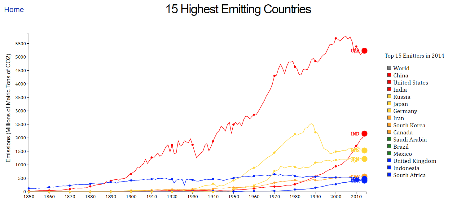
- Top 15 Chart: Shows the Top 15 CO2 emitting countries historical emissions. The world is also shown for comparion. The y-axis automatically scales to the data (this took a long time to figure out in d3) and tooltips on mouseover show the CO2 emissions for that year.

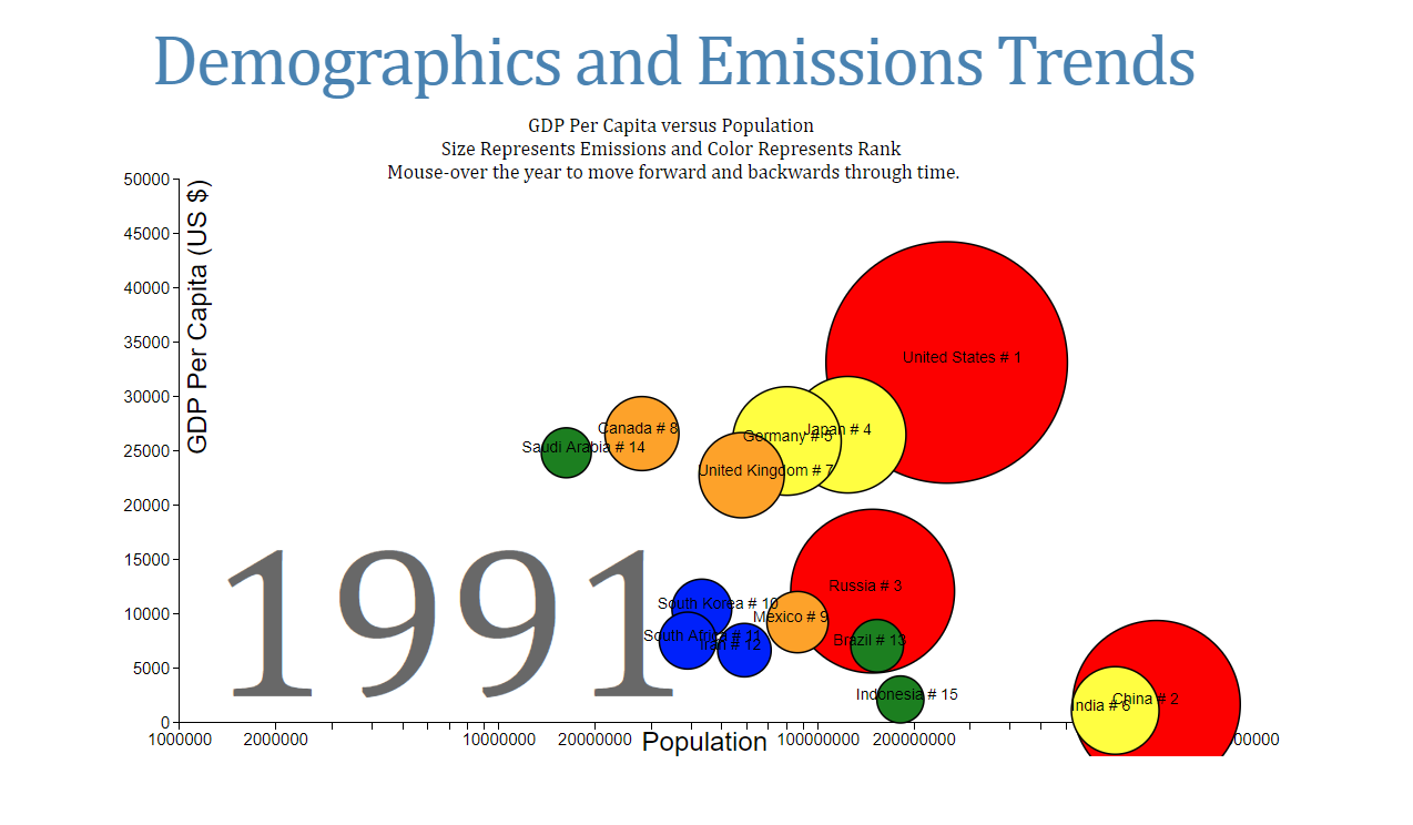
- Demographic and Emissions Trends: Presents 4 pieces of information for the top 15 emitting countries on one chart. The y-axis is GDP per capita (a measure of a country's wealth), the x-axis is population,the size of the circles is the amount of emissions (area of the circle is proportional to emissions), and the color indicates the country's rank for that year. The graph automatically transitions through all the years (1850-2014) and a year also can be selected by moving the cursor over the year on the graph. Text displays the name of the country and the rank for that country.

The landing page provides access to all three of these visualizations and the about page contains general information and links to references.
Data, Methods, and Sources
The data for the emissions explorer came from three different locations and is all publically available.
The emissions data is from the Climate Data Explorer, the majority of socio-economic data is from (Gapminder)[https://www.gapminder.org/] and helpfully curated by (Tom Carden)[https://github.com/RandomEtc/mind-gapper-js], and the most recent socio-economic data is from the World Bank.
The code to clean the data was written in Python. The Jupyter Notebooks for data cleaning are available in this repository (although they are not yet commented). It's often said that 80% of a data analysis project is data cleaning, and while that was not quite the case for this project, getting the data in a suitable format was challenging. The final data is mostly in json with one csv file.
The visualizations themselves are created using d3.js, Data Driven Documents, a Javascript library for creating detailed, interactive charts. D3 was created by Mike Bostock and his tutorials and work were very helpful for creating this project. Scott Murray also has many helpful D3 tutorials that I have learned from over the past year. Most of the css is based on templates, and the about page was adapted from orderedlist. In addition to the sources mentioned, I also have the thank the countless Stack Overflow contributors as I extensively consulted the site for this project.
Any questions, comments, or discussion is highly encouraged. Reach out to me on GitHub or Twitter. I'm always looking for new data science projects!
Thanks also to the HackCWRU V organizers and sponsors for putting on a great event!

Log in or sign up for Devpost to join the conversation.