


Pulp Art Technique

This week in the ROCKETEER I’ll be discussing pulp art. Specifically, the wonderful interior illustrations created by Edd Cartier during the late 1940’s. I can’t say enough about the quality of Cartier’s art. His line work is lovely and expressive, his design sense is great, he actually illustrates the story as written, and his art often has a touch of humor associated with it.
His pen and brush may not have produced works as glitzy as Virgil Finlay’s but I consider Cartier the better artist. Finlay was a workhorse and a talented one. But his line marks were straight-forward and lacked variety. He was masterful and his pieces were very grand but they were usually on a large scale—epic figures or conceptual metaphors. Lawrence Sterne Stevens was much the same. But Cartier’s drawings pulled you in. They were often funny, or absurd. They could be romantic or as easily show the scene of a murder. If he illustrated a mythical figure (and he often did for UNKNOWN) they were of a human scale. His BEM’s (Bug-Eyed Monsters) were appropriately absurd and his demons or imps, terrifying. Finally, he used design to highlight both action and the absurd, equally well.
I have been studying Cartier’s work for some time and am currently experimenting with some of his design ideas for a new series of “Moon Man” illustrations. I find his work from the late 1940’s of particular interest. Since these pieces illustrated detective stories they seem perfect for my study as I write a pulp detective story of my own.
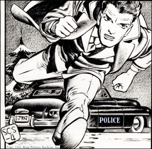
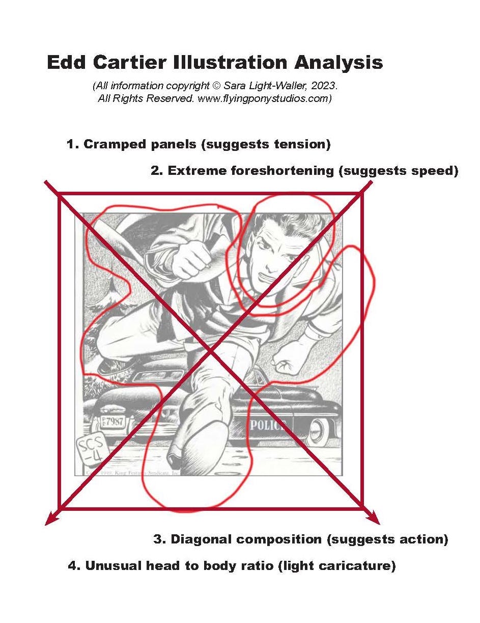
Next, I will present the kind of scrutiny I usually do when analyzing a drawing. I will then show you a new drawing of my own which uses the same techniques. Above you can see the drawing I’m looking at today, a wonderful illustration from 1949. I know almost nothing about the piece but you can tell from the storytelling that the running man is a cop and he’s in a big hurry. You know you can trust him. How? It has to do with the proportions. More on that in a moment.
Cartier does several things here which add up to a sense of speed and urgency. Let’s look at them one by one.
1. Cramped panels. The figure is forced into a tight square and parts of him are cropped out. This immediately suggests tension. The character is forced into a box and constraint adds a sense of danger and general discomfort to the scene.
2. Extreme foreshortening. Most people don’t use this extreme type of foreshortening. Generally, it doesn’t make a lot of sense to look at but in this case it creates dynamic action. The figure is tilted forward over his leading leg creating a sense of extreme speed and awkwardness, suggesting that he might trip and pitch over at any moment.
3. Diagonal composition. Any composition on the diagonal suggests action, leading to a sense of motion or pressure.
4. “Odd” proportions. This is something I’ve been thinking about for some time. Cartier’s people are just so cute! It finally occurred to me that the reason for this is that he’s changed the normal 1:8 or 1:7 head to body ratio to 1:5 or 1:4. With slightly larger heads people seem more “cute” (think “Chibi” in manga or anime) and this adds a touch of humor to his illustrations. It also serves to decrease the extreme tension projected by techniques 1-3. Cartier’s people look a bit awkward and I believe this was deliberate. He’s a very good caricaturist and changing the proportions makes it easier to create a caricature. This running fellow isn’t caricatured very much but some of Cartier’s other illustrations from the period are. Regardless, you feel a sense of connection with this man as he’s very appealing due to his slightly larger head size.
Here is the drawing I created to experiment with these techniques.
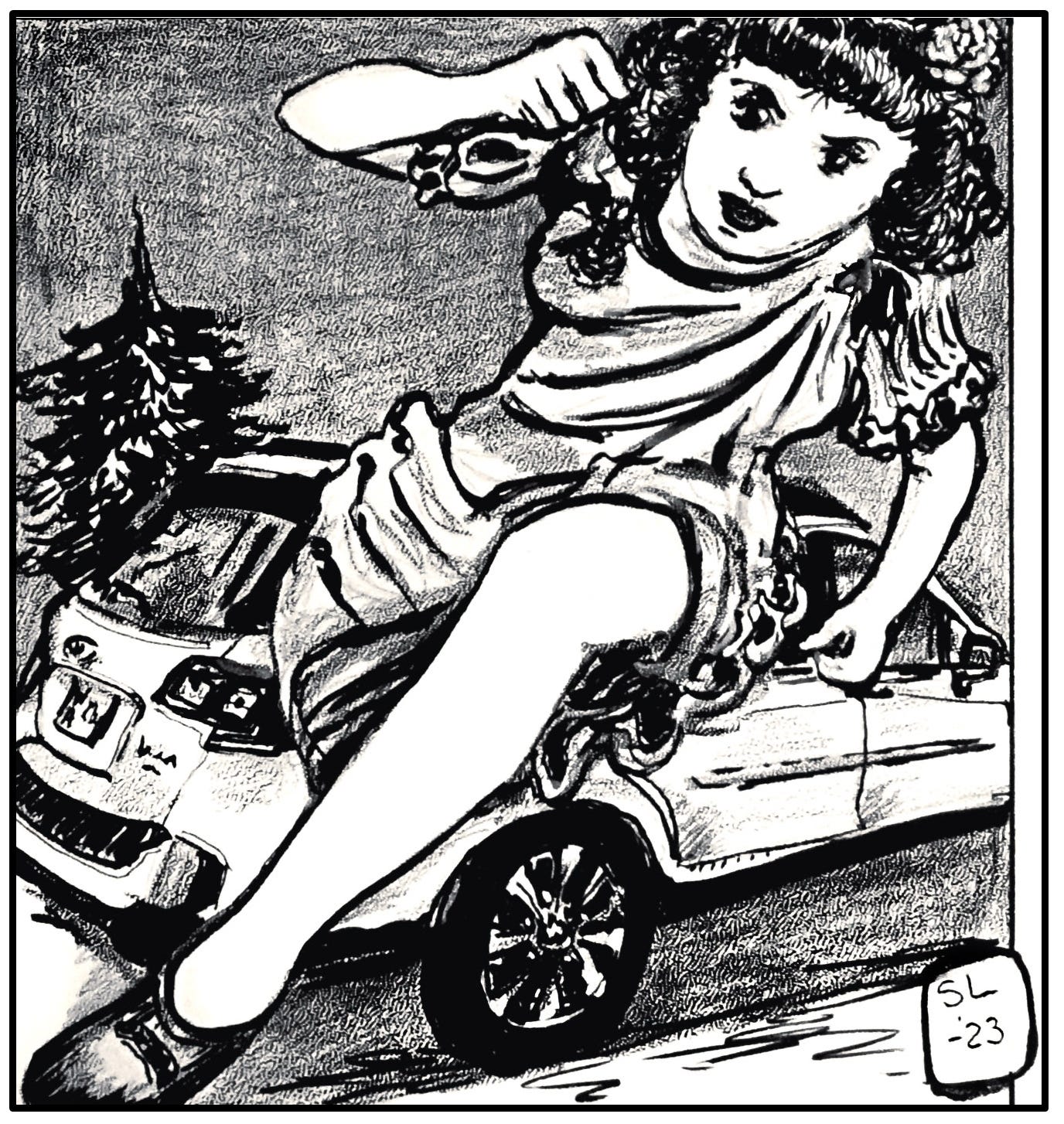
The running girl in an extremely foreshortened pose, it’s clear she’s running hell-bent-for-leather.
The design is set on the diagonal as is Cartier’s suggesting extreme movement so you know she’s running fast.
I’ve changed the girl’s more “normal” proportions to a ration of 1:5 (head to body) as Cartier did with his people. This creates a cute, girlish look.
The rendering techniques I’ve used here are similar to his—brush and ink with graphite/and or litho crayon on coquille board or paper.
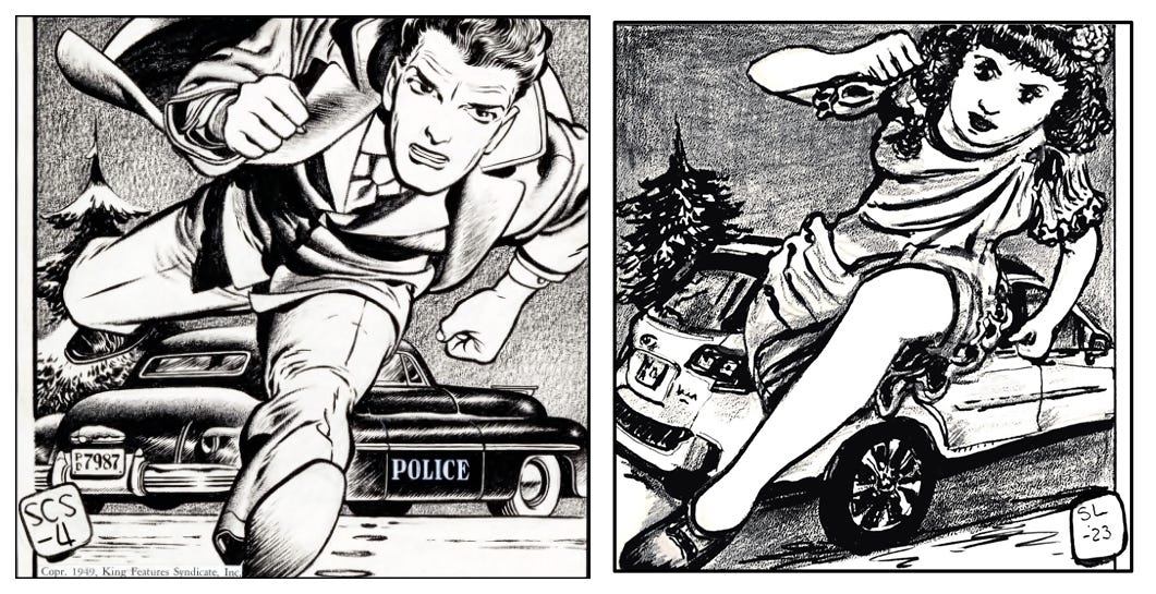
In Cartier’s piece we can see that it’s Winter. I have chosen to leave off the snow as my girl is dressed for warm weather.
Now for some personal critique.
Unlike in Cartier’s piece there’s no sense of why the girl is running. Is she hot to get somewhere? Or, is she running away? We don’t see anything behind the girl so it seems she’s running towards something.
In this context the car doesn’t mean anything. I used my own Subaru as a model and unlike using the period police car in Cartier’s drawing there’s a weird sense of cognitive dissonance about a girl in 1940’s–ish hair and dress and a modern car.
Overall, I’m pleased with how the running girl turned out. She proves that this group of techniques, when used together, create repeatable results. I will definitely do more along these lines in the future.
This is the Rocketeer signing off for today.