13
Dr. Charles Cramer and Dr. Kim Grant
In this chapter
De Stijl, Part I: Total Purity
De Stijl is one of the most recognizable styles in all of modern art. Consisting only of horizontal and vertical lines and the colors red, yellow, blue, black, and white, De Stijl was applied not only to easel painting but also to architecture and a broad range of designed objects from furniture to clothing. This is not inappropriate. Despite its close association with Piet Mondrian, the artist thought of it not as his personal style, but as De Stijl–The Style; it was objective and universal, applicable to all people and all things.
We will discuss De Stijl in three parts. This first part will introduce the elements of De Stijl, the second will examine the processes of abstraction that led to De Stijl, and the third part will examine the application of De Stijl to architecture and design.

De Stijl and Theosophy
Mondrian partially attributed his arrival at the elements of De Stijl to Theosophy, an occult philosophy promoted by thinkers such as Madame Blavatsky and Rudolf Steiner. Theosophists sought knowledge of higher, spiritual truths than those available to science, and often claimed to have access to those truths through direct spiritual insight. Mondrian became a member of the Dutch Theosophical Society in 1909, and painted a number of works around that time that explore mystical awareness.
His Evolution triptych (1910-11) shows the “three spirits” that Madame Blavatsky described as living within humankind: terrestrial (on the left), sidereal or astral (on the right), and divine (in the center). Such works show Mondrian’s interest in finding a visual language for expressing spiritual things, but they are far from the radical abstraction that he later arrived at. In fact, allegorical paintings of spiritual and occult subjects have a long tradition, with roots in the nineteenth-century Symbolist movement, and even farther back in the Renaissance and Baroque periods.
While Theosophy certainly informed the spiritual goals of De Stijl, its influence on the actual style of De Stijl is less clear. The Dutch mathematician and Theosophist M. H. J. Schoenmaekers, whom Mondrian met in 1916, wrote an essay the year before in which he asserted that, “The three essential colors are yellow, blue, and red.” He also declared that, “The two fundamental and absolute oppositions that shape our planet are: the horizontal line of the earth’s trajectory around the Sun, and the vertical trajectory of the rays that emanate from the center of the sun.”[1]
These quotes are, however, just two examples from a torrent of wildly different suggestions that Theosophists made for visualizing the spiritual. Other artists influenced by Theosophy developed very different styles (Vassily Kandinsky and Hilma af Klint, for example). So why did the practitioners of De Stijl believe that their style was the most authentic expression of universal spirituality?

Blue, yellow, red, black, white
It helps to think of the elements of De Stijl as building-blocks: structural components that, in different combinations, can be used to make everything in the universe. Take for example De Stijl’s limited palette of red, yellow, and blue. These are what are called the “primary” colors, because if you had perfectly pure versions of each of these colors, you could create every other color. Red + yellow in different proportions create every shade of orange; blue + yellow create the shades of green; blue + orange create brown, and so on. Similarly, by combining black and white, you can make every shade of gray in between.
Red, yellow, and blue are “primary” colors in another sense as well. Although you can mix red and yellow to make orange, or red and blue to make violet, you cannot mix violet and orange or even red-violet and red-orange, to make pure, primary red. It is for this reason that the artists of De Stijl could not have chosen orange, lavender, and teal. Not only are those colors impure (teal is a mixture of blue and green), they are also not fully representative of the color spectrum; if you had only those three colors you could never create red, yellow, or blue.
Color printers rely on this principle, although the primaries that work best in this case are cyan (a light greenish blue), magenta (a blueish red), and yellow. Together with black ink and the white of the page itself, a four-cartridge CMYK printer can reproduce every color in a photograph of you and your friend at the beach, from the subtle teals of the water, to the dull reddish-brown of the rocks, to the brilliant yellow of the sand.
Horizontal and vertical lines
The justification for De Stijl’s use of only horizontal and vertical lines is somewhat trickier, and it helps to think of them not as ‘lines’ but as directional forces or vectors: dynamic structuring factors, rather than stable structural components. If you recall from working with coordinate planes in mathematics, any kind of regular line can be expressed in a formula that describes the movement of a point along a regular grid defined by ‘x,’ the horizontal axis, and ‘y’, the vertical axis.
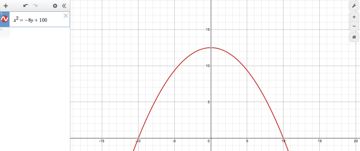
A diagonal line at a forty-five degree angle would be expressed as x = y, for example: for every unit moved in a horizontal (x) direction, move the same unit in a vertical (y) direction. The parabola of a soccer ball punted upfield might be x2 = -8y +100. Thus any rational line could be expressed mathematically as a motion defined by two interacting forces, a horizontal force and a vertical force.
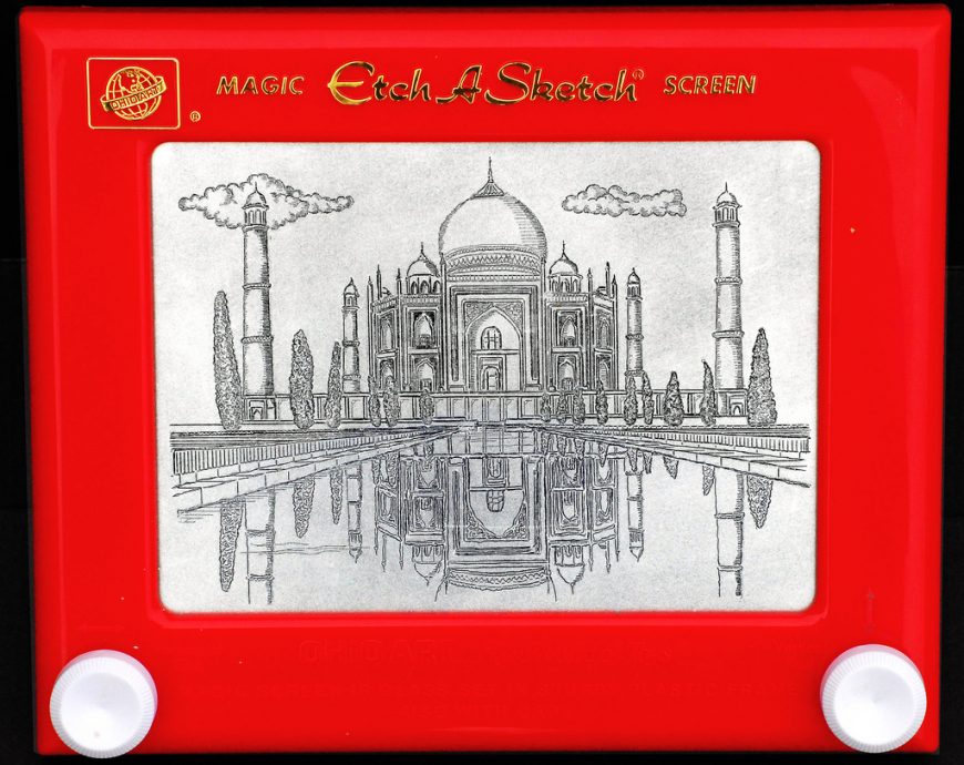
To put this into what may be more familiar terms, think of an Etch-a-Sketch machine. There are just two control knobs, one for the horizontal motion of a black line on the gray screen, and the other for vertical motion. But by simultaneously manipulating both knobs, you can draw diagonal or curved lines to create triangles and circles — or a baseball cap, a human face, and even a chaotic scribble that would seem impossible to reduce to an “x, y” formula.
De Stijl’s horizontal and vertical lines are like the shape-making vectors controlled by the Etch-a-Sketch knobs. In the same way that a printer combines just a few primaries to make any color, by manipulating the horizontal and vertical forces of an Etch-a-Sketch, you can draw anything in the universe, from a box, to a tree, to the Taj Mahal.
Building-blocks of the universe
To give one more analogy by way of conclusion, the elements of De Stijl are the artist’s equivalent of the physicist’s fundamental building blocks: protons, neutrons, and electrons. With a bucket of each of these atomic building blocks, you could make anything in the universe, from hydrogen (one proton + one electron), to oxygen (eight protons + eight electrons + eight neutrons), to water (two hydrogen atoms + one oxygen atom), to a protein, a paramecium, and eventually even a person.
Similarly, if you have buckets of pure red, yellow, blue, black and white paint, and a lot of skill on an Etch-a-Sketch machine, you could represent absolutely anything. It is in this sense that De Stijl is universal, “the” style, and not just the personal style of Piet Mondrian or the style of some specific region or period in time. Although our own historical moment tends to celebrate cultural and individual differences and reject “absolutes” or “universals,” De Stijl has a decent claim to being, as its name asserts, The Style for all things, all time, and all people everywhere.
De Stijl, Part II: Near-Abstraction and Pure Abstraction
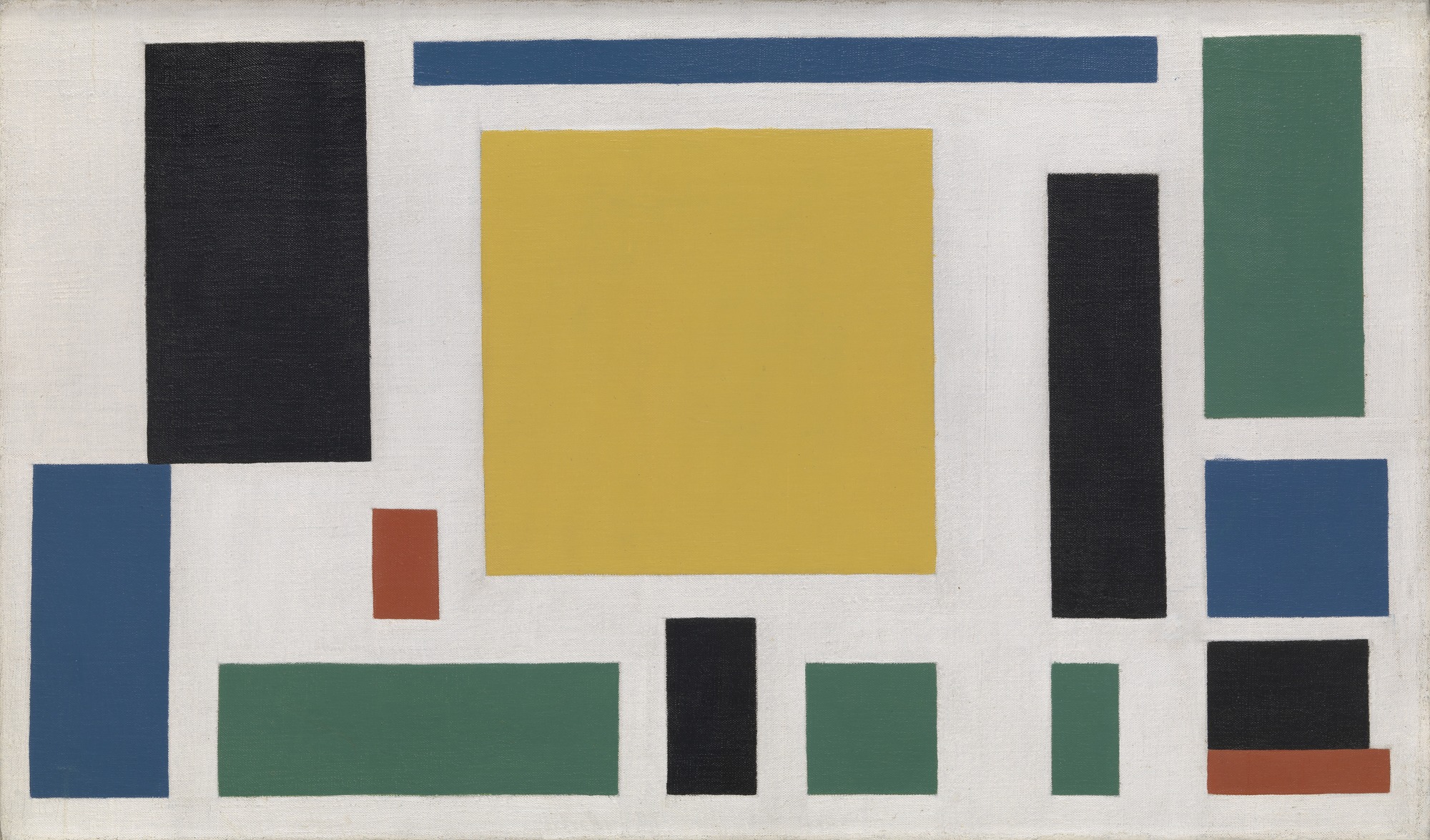
Theo van Doesburg’s Composition VIII consists of just fourteen rectangles. One nearly perfect yellow square in the center is surrounded by thirteen rectangles of different proportions: four green, three blue, four black, and two red. They are scattered evenly across the surface, not overlapping (although two pairs abut), and are carefully aligned with the edges of the rectangular white canvas. This seems to be a good, and fairly early, example of what is called “abstract art,” art without any subject matter or visual resemblance to actual objects in nature.
In what appears to be a ludicrous parenthetical statement, however, the title also declares the work to be a cow. And indeed, there are a number of preliminary studies by van Doesburg that may justify that subtitle.
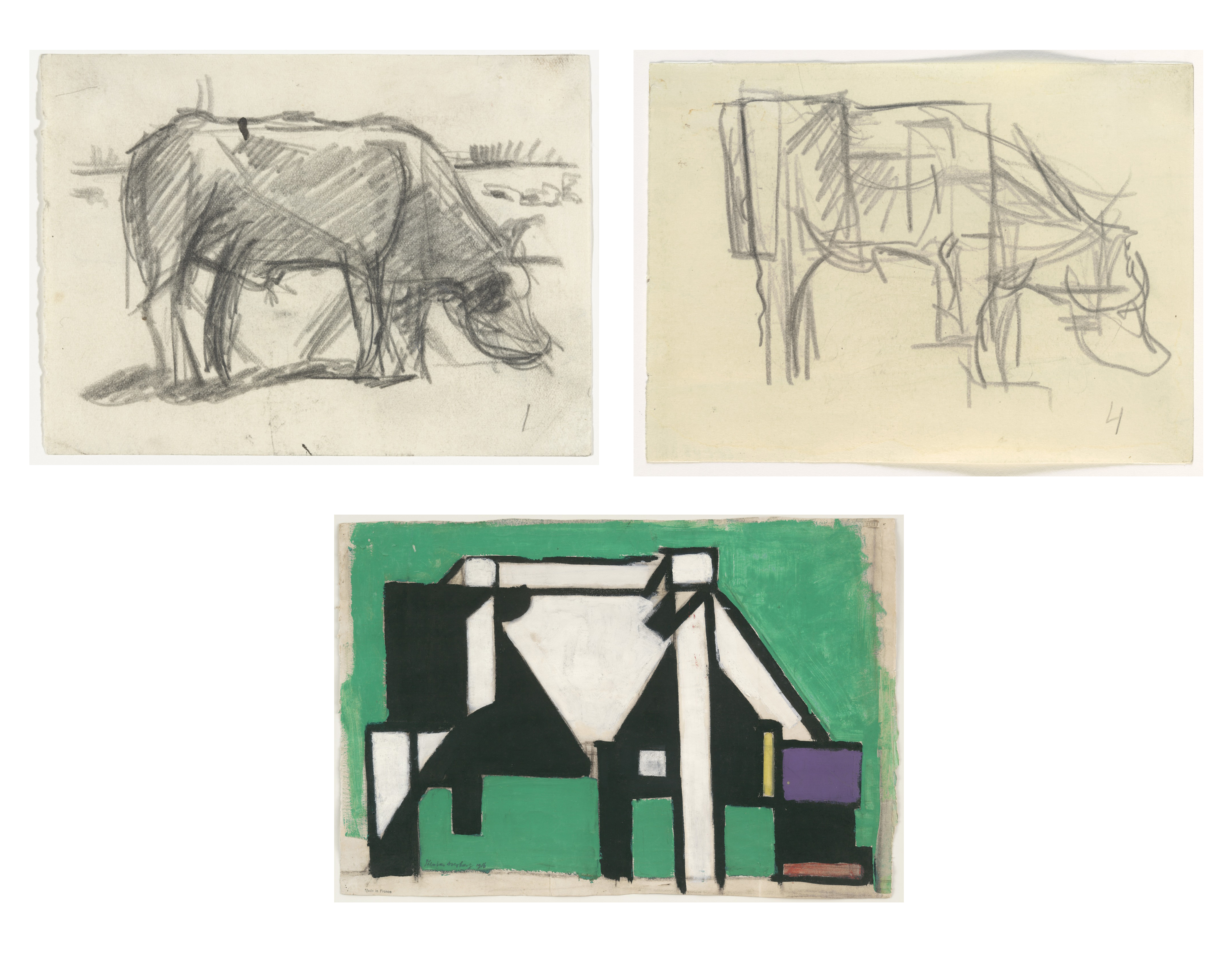
One graphite drawing is immediately recognizable as a cow or bull grazing head down in a field, despite its sketchy execution and the simplification of its muscular contours. Another graphite drawing squares off those contours; the cow’s hip and thigh muscles are simplified into a block, and the rear leg is straightened into an elongated peg. A painted study continues this squaring off process. The head is now composed of a few rectangles: a broad forehead in purple, a black snout terminating in a nested red band, and a yellow antenna-like vertical suggesting an ear.
Now it is possible to see Composition VIII as a cow as well. The central yellow square is a massive, weighty ribcage, and the black rectangle on the left is a hip, with the blue and red below representing two legs. In the lower right is a tripartite head: blue forehead, black snout, and red mouth/nostrils. The title is appropriate after all; at first sight what we see is just an abstract “composition” of colored rectangles, but hidden within is a cow.
Near-abtraction and pure abstraction
This set of works introduces what is an important distinction for modern art: the difference between near-abstract art and pure-abstract (non-representational) art; or better yet, the difference between abstraction as a verb and abstraction as a noun. Pure-abstract art is abstraction as a noun: the work is begun without reference to natural objects, and intends no reference to natural objects.
The artists of De Stijl did eventually end up practicing pure-abstract art, but first van Doesburg and Mondrian spent nearly a decade in the gray area of near abstraction: starting with recognizable scenes, then drawing them away from their natural appearances. This is to practice abstraction as a verb: the etymology of the word derives from “ab” = “away” + “trahere” = ‘”to pull” (the same root as the word “tractor”).
A gradual process
In his 1919 “Dialogue on the New Plastic,” Mondrian explains how he “very gradually” arrived at the straight lines of De Stijl, starting with the complex lines found in nature: “First I abstracted the capricious, then the freely curved, and finally the mathematically curved.”[2] This use of the term abstraction as a verb suggests a process; by gradually “pulling away” the contingencies and imperfections of natural objects, the artist can gradually purify nature of its “accidents” to discover its essence. This process would eventually lead to a spiritual abstract art, abstraction as a noun, as Mondrian had already realized in a note written in a sketchbook around 1912-14:
“If one conceived of these forms as increasingly simple and pure, commencing with the physical visible forms of appearance, then one passes through a world of forms ascending from reality to abstraction. In this manner one approaches Spirit, or purity itself.”[3]
Abstraction as purification
Mondrian’s work between around 1908 and 1920 exemplifies this gradual abstracting process starting from a number of natural objects and scenes: a landscape of a pier and ocean, a church in the Dutch town of Domburg, and, most famously, trees.
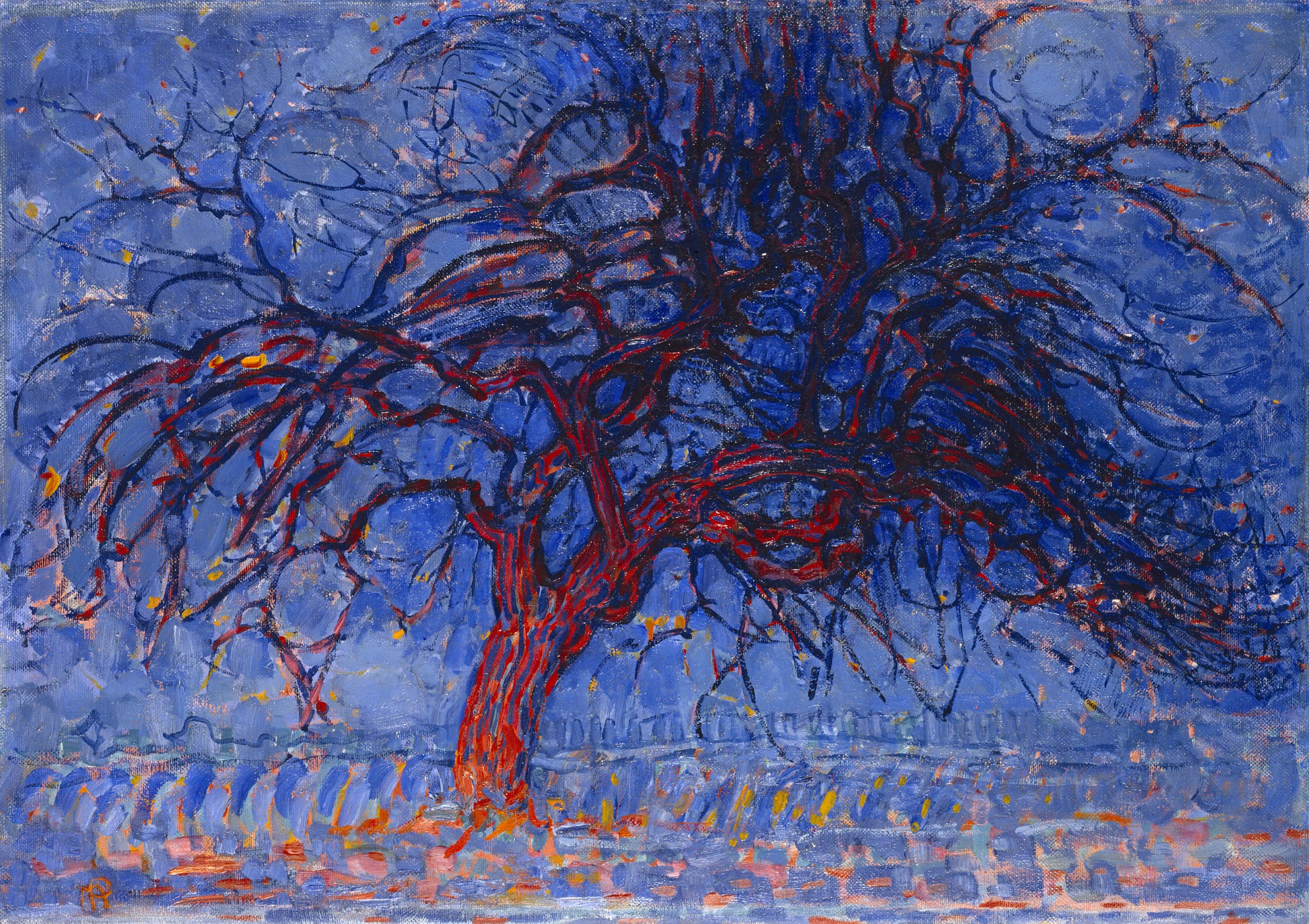
In the tree series, Mondrian starts with an immediately recognizable apple tree. The color is intensified, but the cool blues suggest the deepening twilight of its title “Evening,” and the red tree glows as if reflecting the sunset. The branches are carefully rendered; every twist and knot is shown, and the texture of the rough bark is conveyed by thick, parallel strokes. The painting concentrates on the surface appearance of the tree, viewed in the light of a specific time of day.

In a later painting of the same subject Mondrian reduced the color to all grays, eliminating any reference to lighting conditions. The branches have also been simplified into sweeping strokes, as though Mondrian was rendering a general blueprint of an apple tree’s spreading growth rather than the details of a particular tree. In a third painting those sweeping curves are generalized further into almost mathematical regularity, with near-perfect parabolas representing the tree’s uppermost branches stretching toward the sky.
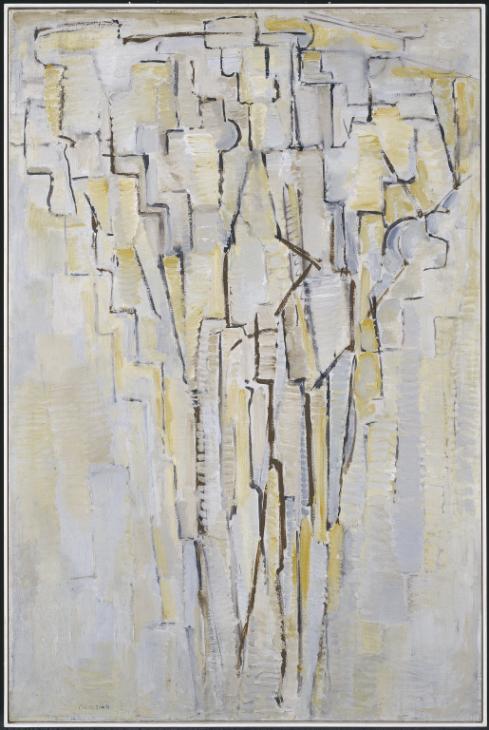
By 1913 Mondrian had reduced most of the curved and diagonal lines of his trees to a step-pattern of horizontal and vertical lines, almost literally embodying his later assertion that he proceeded by abstracting first the “capricious” curves, then the “freely curved,” and finally the “mathematically curved” in order to arrive at the horizontal and vertical lines of De Stijl.
Composition and harmony
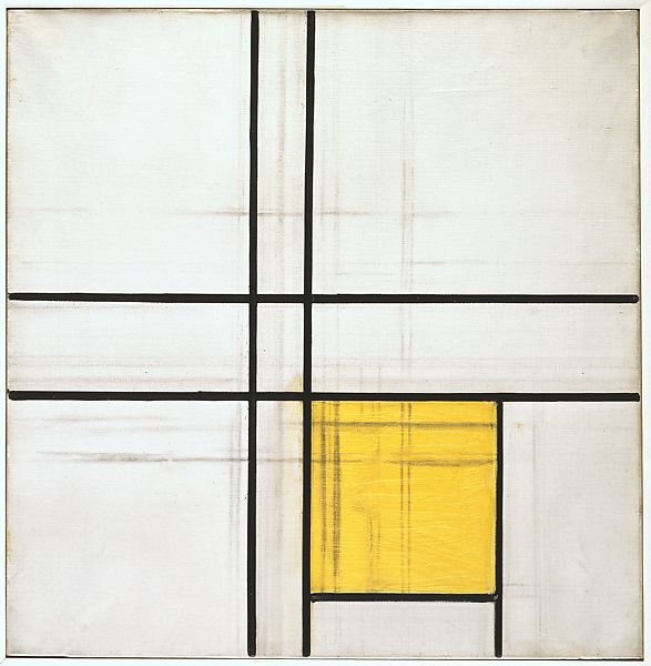
After nearly a decade of abstracting from carefully-observed natural objects, the project of De Stijl changed. Although it is not obvious when looking at their works, at a certain point Mondrian and van Doesburg stopped working from nature—from trees or cows—and began working directly with the elements of De Stijl: horizontal and vertical lines bounding flat areas of yellow, blue, red, black, and white. At this point the focus of the work changed from abstraction as a verb to abstraction as a noun, from distillation to composition.
Having discovered the pure building blocks of the universe, they began using those building blocks to create compositions independent of any reference to natural objects. The goal was now to create an aesthetic harmony or compositional balance that is not available in nature.
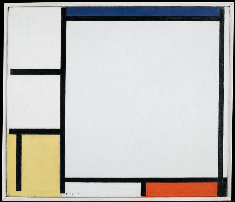
For example, in Tableau 2 (1922), an equilateral triangle is created within the square of the canvas by balancing the three areas of color around its edges: the red to the lower right, the blue just below middle left, and the yellow and black corner in the upper right. The square format of the canvas gives a sense of overall stability, while the implied triangle tilts toward the right, creating a dynamic internal equilibrium.
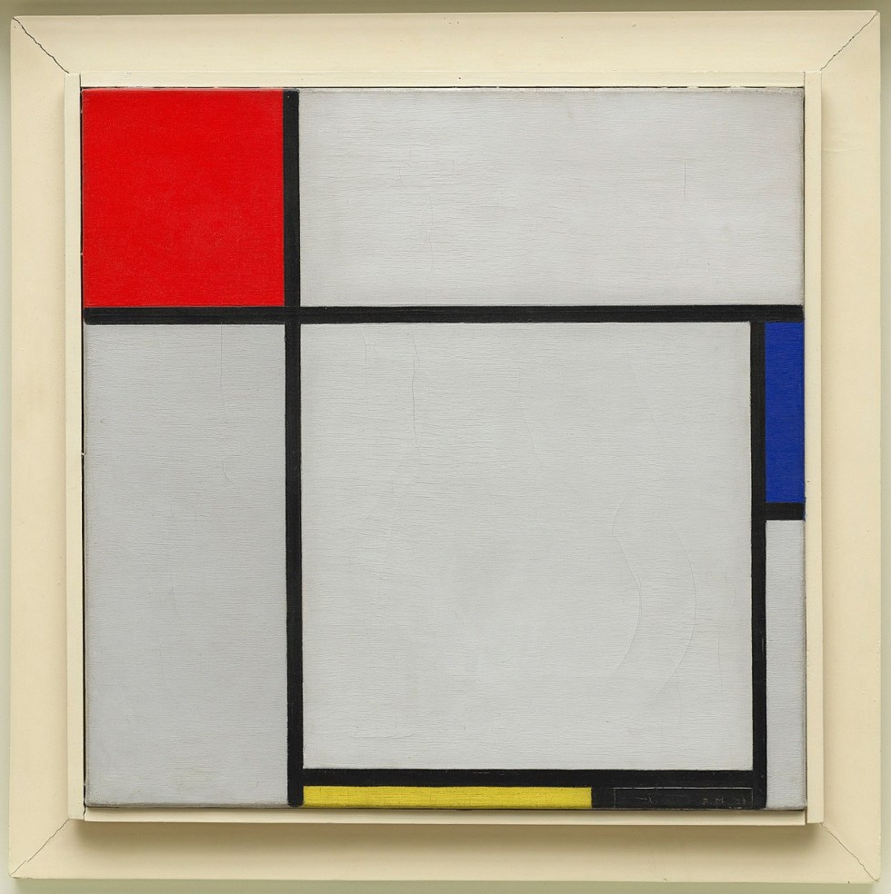
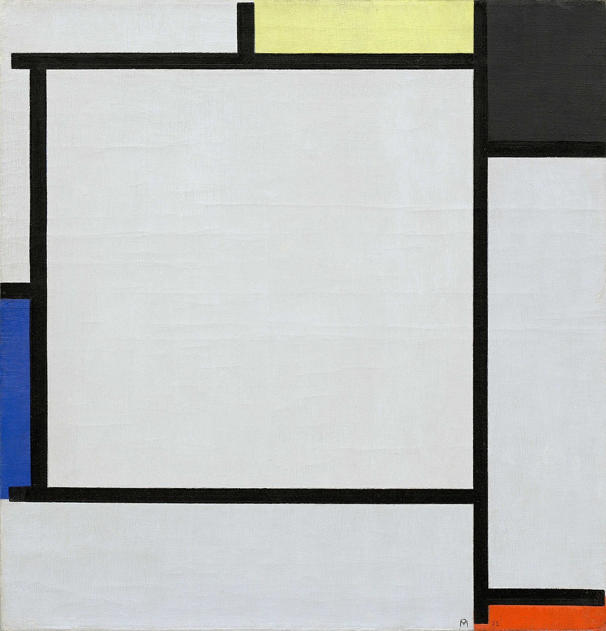
Composition with Red, Blue, Yellow, and Black (1929) has an asymmetrical but satisfying balance around a square in the lower right. Three colored rectangles surround this square: a red square in the upper left joins with the yellow rectangle below and the blue rectangle to the right to create another implied triangle. In both compositions, as a response to the different visual “weights” of the three primary colors, the pale yellow rectangles are paired with a black rectangle to balance the more visually powerful red and dark blue.
This project of creating dynamically balanced compositions using the elements of De Stijl occupied Mondrian for two decades. Unfinished works from this period show his intuitive and sometimes very tentative and slow process. He would push black lines and color areas around until they came together in a composition that satisfied his quest for absolute purity and total harmony.
Irritated by nature
Mondrian’s early biographer Michel Seuphor described how the artist was so “irritated” by nature and the color green that when seated facing the window, he asked if he could change places so he would not have to look at the trees outside.[4] This may seem odd since many people think a view of trees is pleasant, and Mondrian himself had made a careful study of trees in order to arrive at De Stijl. But for Mondrian, nature was impure, contingent, materialistic, and aesthetically dissonant; it was the opposite of the pure, spiritual harmony that he sought and found in De Stijl.
De Stijl, Part III: The Total De Stijl Environment
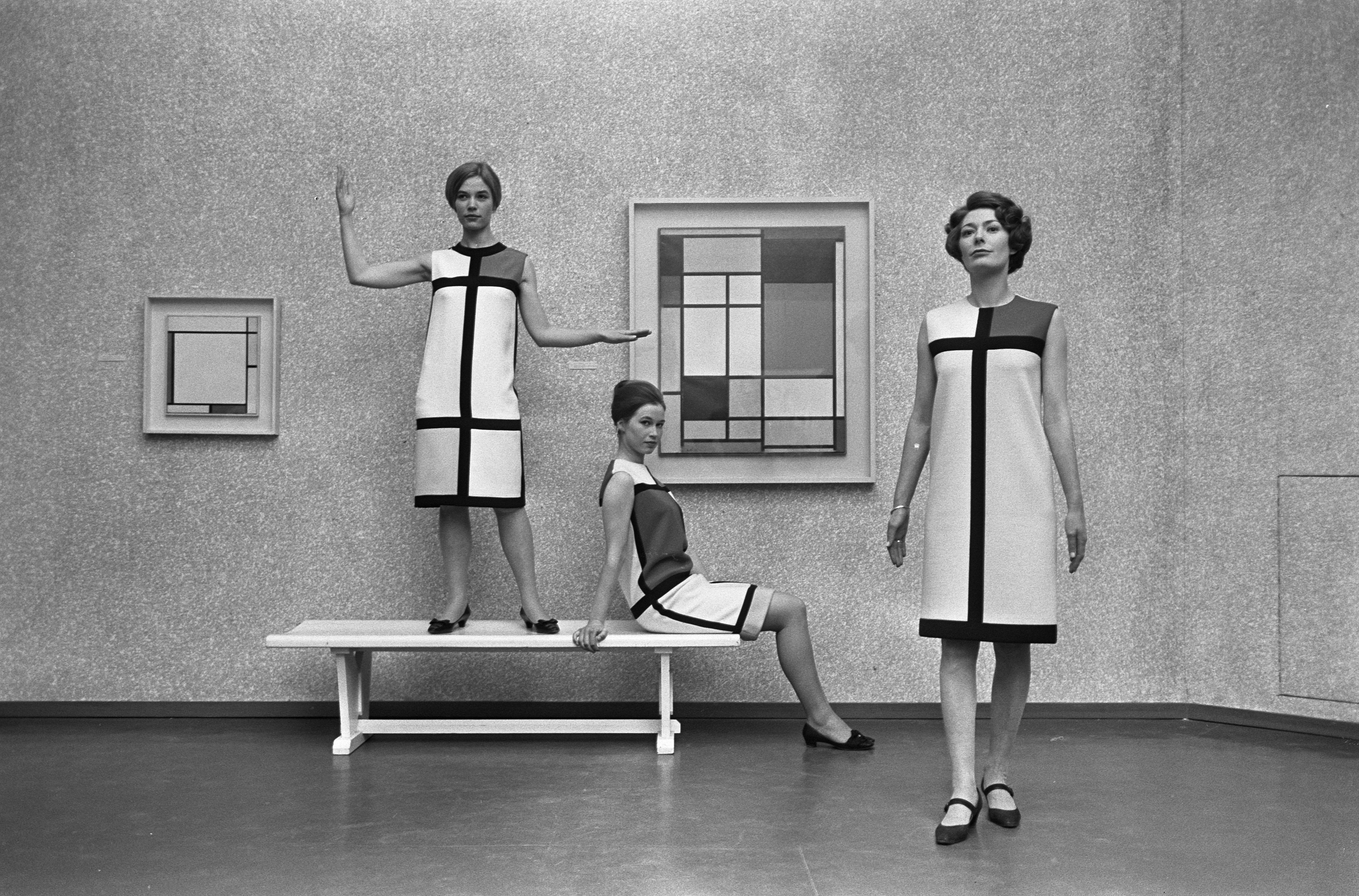
In 1965, French fashion designer Yves Saint Laurent created a set of six cocktail dresses in the style of Piet Mondrian, using only red, yellow, blue, and white rectangles bounded by black horizontal and vertical lines. The cut of the dresses was A-line, with no darts or belt, and the weight of the fabric was calculated to ensure that it hung straight, with minimal wrinkling or movement. Today, an internet search for “Mondrian car,” “Mondrian chair,” “Mondrian tea towel,” and the like will find any number of De Stijl-inspired home products for purchase.
A universal style
While it may seem like crass commercial exploitation to see the pure, spiritual art of De Stijl applied to product design, in a way it actually serves to fulfill the ultimate long-term goal of the movement, which was to make the style truly universal. Mondrian wrote many essays discussing how De Stijl could be seen in modern architecture, product design, city planning, and even music.
Similarly, Theo van Doesburg, editor of the journal De Stijl, was an architect who preferred to design total environments, including the furniture and wall decoration. Bart van der Leck, one of the co-founders of De Stijl (although he refused to sign their “manifesto”), designed De Stijl-inspired stained glass, a typeface, and posters, as well as hangings and carpets sold by the Dutch department store Metz & Co.
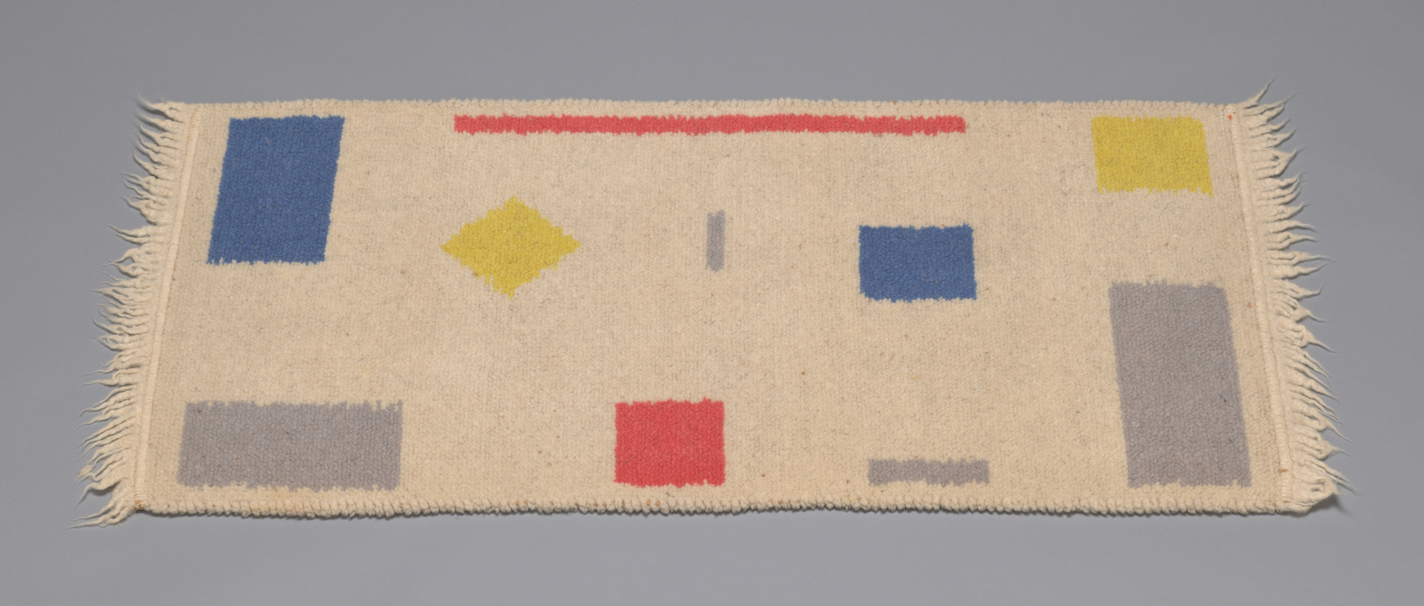
Provided that all of these products not only use the elements of De Stijl, but are also composed in a way that is sensitive to the sort of harmonious balance sought by Mondrian and his fellow artists, this expansion beyond the museum painting and into the terrain of everyday life is entirely appropriate.
Entering paradise
If a single De Stijl painting represents an oasis of absolute purity and harmony in a world that is woefully short of both of those qualities, and if an encounter with a De Stijl painting can help to purify and harmonize the human spirit, think how it would be to live in an entire De Stijl environment.
Mondrian himself sought to move beyond the isolated easel painting. Although there are inevitable aesthetic compromises that come with designing architecture, enough purity and harmony can be retained that the individual living in an entire De Stijl environment will be, in Mondrian’s words, “uplifted through beauty toward universal life.”[5]
When Mondrian moved back to Paris following the end of World War One, he painted all of his furniture white and decorated the walls with planes of colored card stock. His friend Maud van Loon described the effect of coming into this space as a spiritual oasis:
The stairwell was horrific, terribly shabby, unsightly … Then you walked through his door and into a brilliantly white studio with a color plane here and there. As you stepped inside, you were in Paradise.[6]
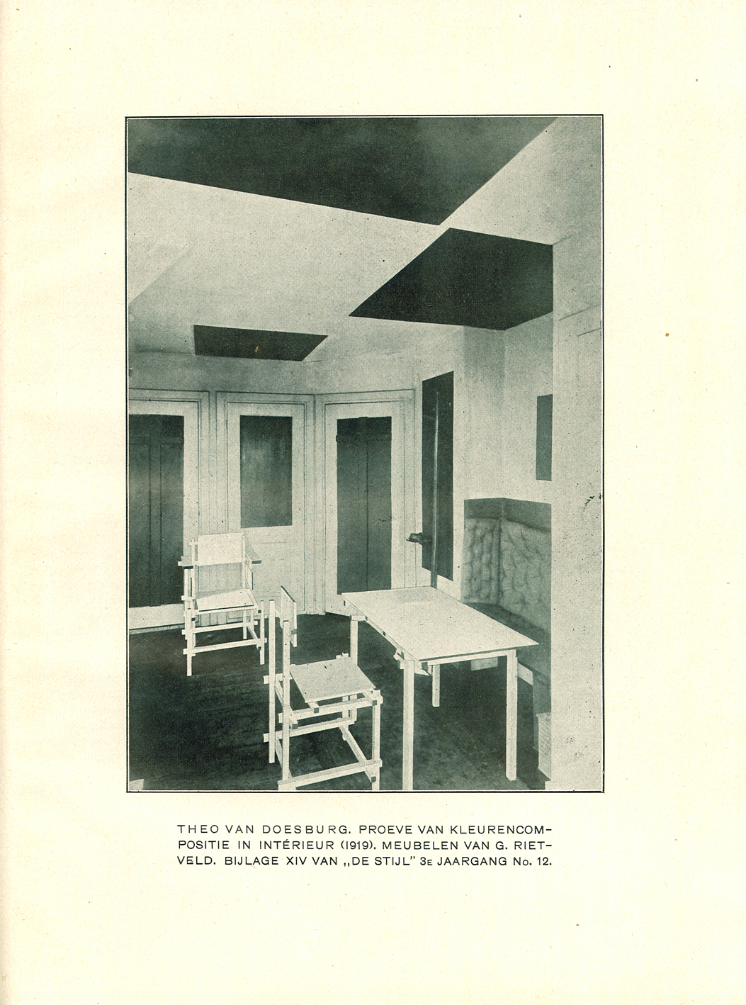
De Stijl architecture
Architecture and interior design were important to De Stijl from the beginning, and in fact architectural renderings dominate the illustrations in the short-lived journal dedicated to the movement, De Stijl magazine. However, in order for architecture to become, in effect, a three-dimensional De Stijl environment, rigorous rules need to be followed.
Ornament must be excluded in order to purify the space as much as possible, so any merely decorative objects or elements must be banished. Functional objects such as chairs and lamps need to be included, of course, but they should conform with the pure elements of De Stijl as much as possible.
Mondrian acknowledged that whereas a painter has total freedom about what shapes to use and where to place them, “Utility or purpose indeed affects architectural beauty … Function can even limit beauty: some utilitarian things … may require a round form, although the straight expresses the profoundest beauty.” In such cases, the designer should use “a pure circle, which is far from capricious nature” and closer to the rigorous geometric purity of De Stijl.[7]
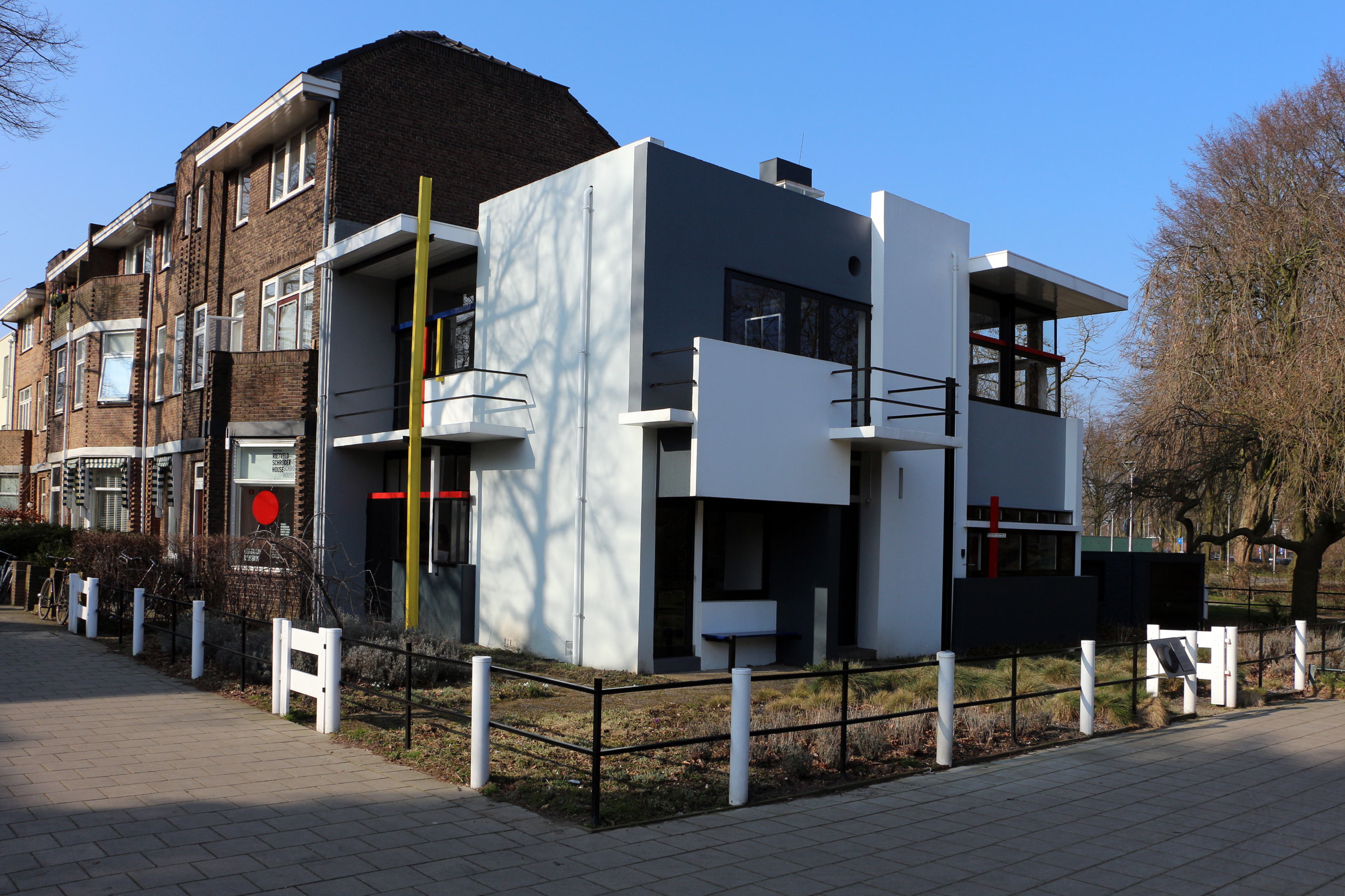
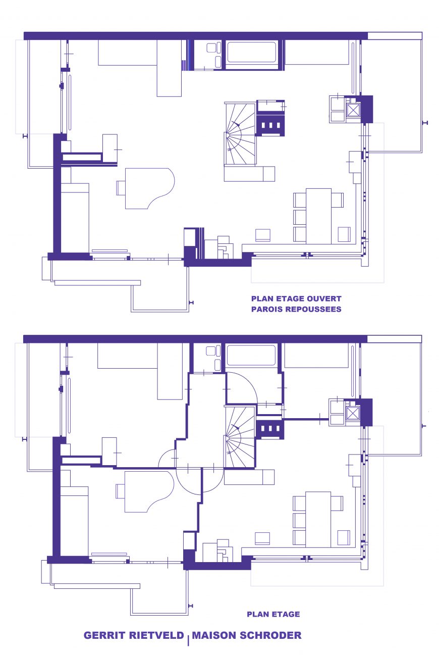
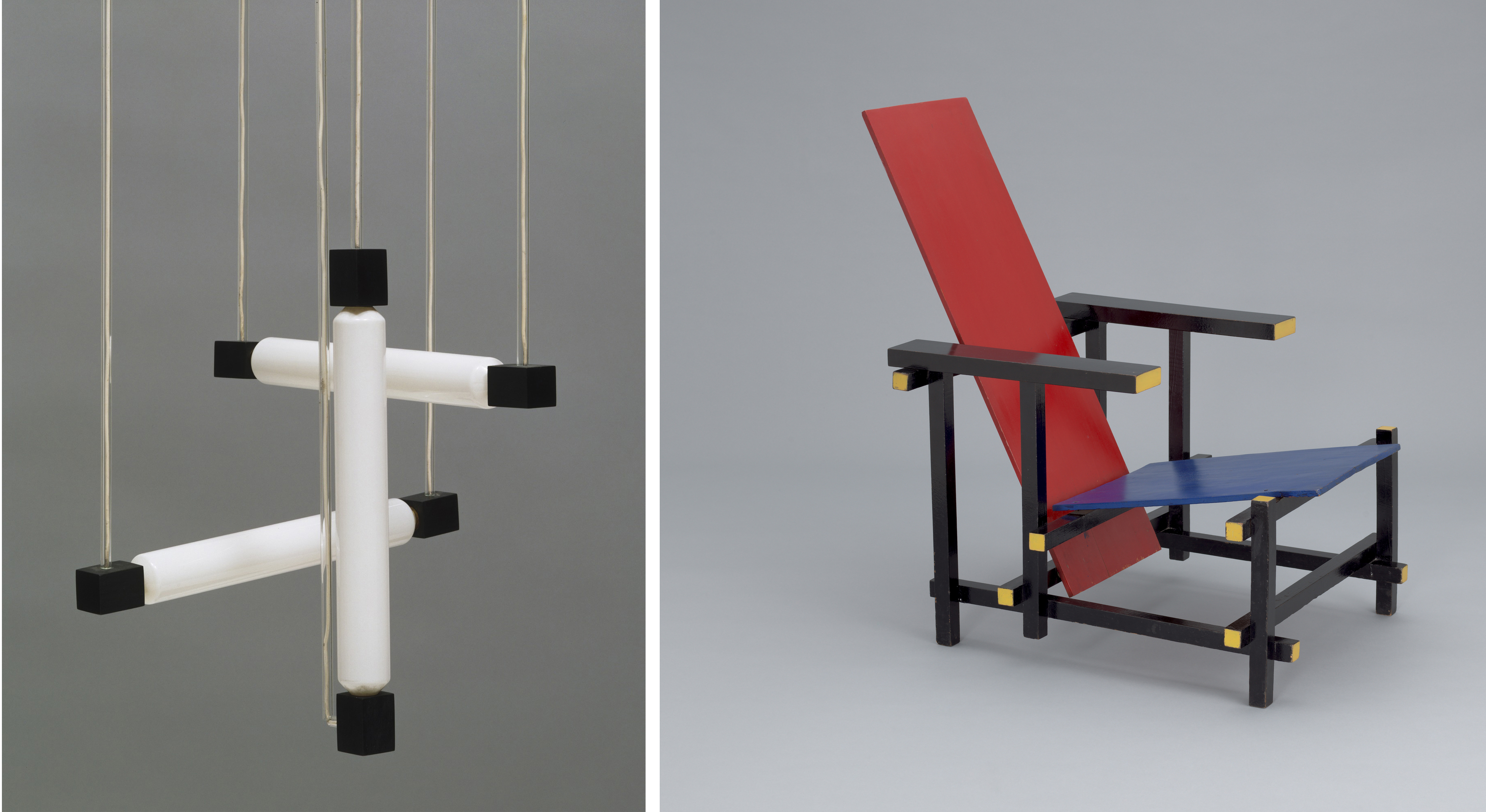
Rietveld’s Schröder House
The best-known example of a total De Stijl environment is Gerrit Rietvelt’s Schröder House (1924). Commissioned by Truus Schröder, a recently widowed mother of three, the house clings oddly to the end of a street of row houses in Utrecht, The Netherlands. Its exterior is composed entirely of white and neutral gray rectangular planes, punctuated by horizontal and vertical linear elements in black, red, yellow, and blue.
One of the architect’s intentions was to integrate the house with its environment, so entire walls and even corners are opened up by windows and French doors. The interior was also designed to be open, especially on the top floor, which had sliding panels that could create separate rooms or one flowing space.
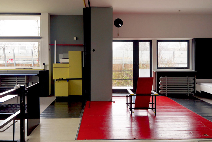
Rietveld also designed as much of the interior and furnishings as possible using the basic tenets of De Stijl. A hanging lamp seems to demonstrate the three dimensions of space: length, width, and height, and is so stripped of unnecessary ornament that it hangs from its own electric cords. His famous Red Blue Chair shows an element of the compromise that Mondrian noted for designing functional objects. A perfectly horizontal seat and perfectly vertical back would be extremely uncomfortable, so Rietveld tilted both slightly to accommodate the organic imperfection of the human body. But the armature of the chair is made of modular beechwood slats oriented in the three dimensions, and of course all is painted in pure De Stijl red, blue, yellow, and black.
The individual and the universal
De Stijl was one of a number of modern movements that believed its utopian aspirations would be best achieved by creating total environments, over which the designer (not the inhabitant) had complete control. As we imagine living in Rietveld’s Schröder House, we may be put off, not only by the barren minimalism of the hard, geometric surfaces, but also by the total lack of individual personality or whimsy. These are environments to which the occupant is expected to conform, rather than adapting the decor to fit the individual tastes of the occupant.
What may appear repugnant in our era, which prizes individual differences and self-expression, was actively embraced by many modern architects and designers. For Mondrian, “If our material environment is to be pure in its beauty and therefore healthy and practical, it can no longer be the reflection of the egotistic sentiments of our petty personality.” If a total De Stijl environment were to expand from the painting, to the home or office interior, to the street and city itself, then all individual components of the environment must be subsumed to an overarching, homogeneous design. Mondrian continues, “And man? Nothing in himself, he will be part of the whole; and losing his petty and pathetic individual pride, he will be happy in the Eden he will have created!”[8]
The Bauhaus, an Introduction
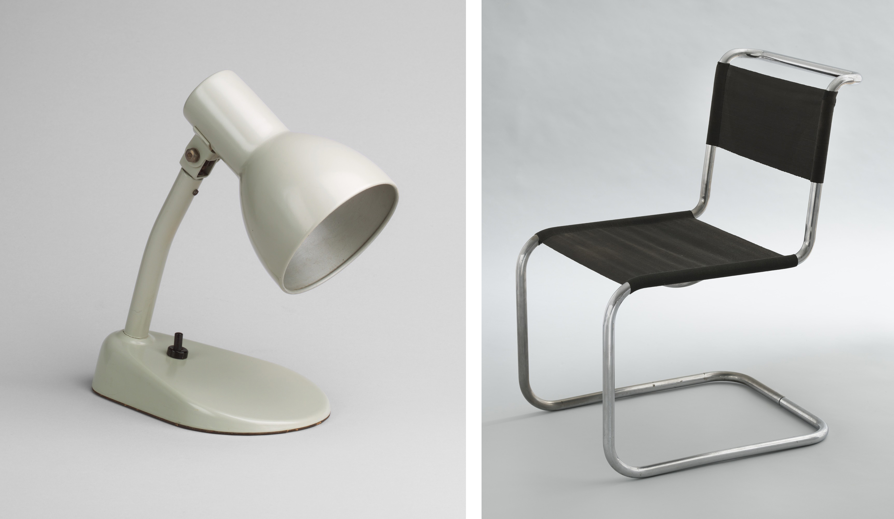
The Bauhaus was an art and design school in Germany whose importance is astonishing given its very brief and tenuous existence. The desk lamp and chair illustrated here are so familiar and so simple that they don’t seem to have required a designer, but they were as radical in their time as they are commonplace now, and their apparent simplicity was the result of a thoughtful and meticulous design education and design process that remains a model today.
During its fourteen years of existence the Bauhaus was forced to change location three times and was ultimately closed as a result of political pressure from the Nazi party. Founded by Walter Gropius in 1919, the school originally had three aims: to abolish the “arrogant” distinction between artist and craftsperson by recognizing the knowledge and skills common to both; to mobilize all arts and crafts towards the creation of total design environments; and, to foster links between the school and local manufacturers.
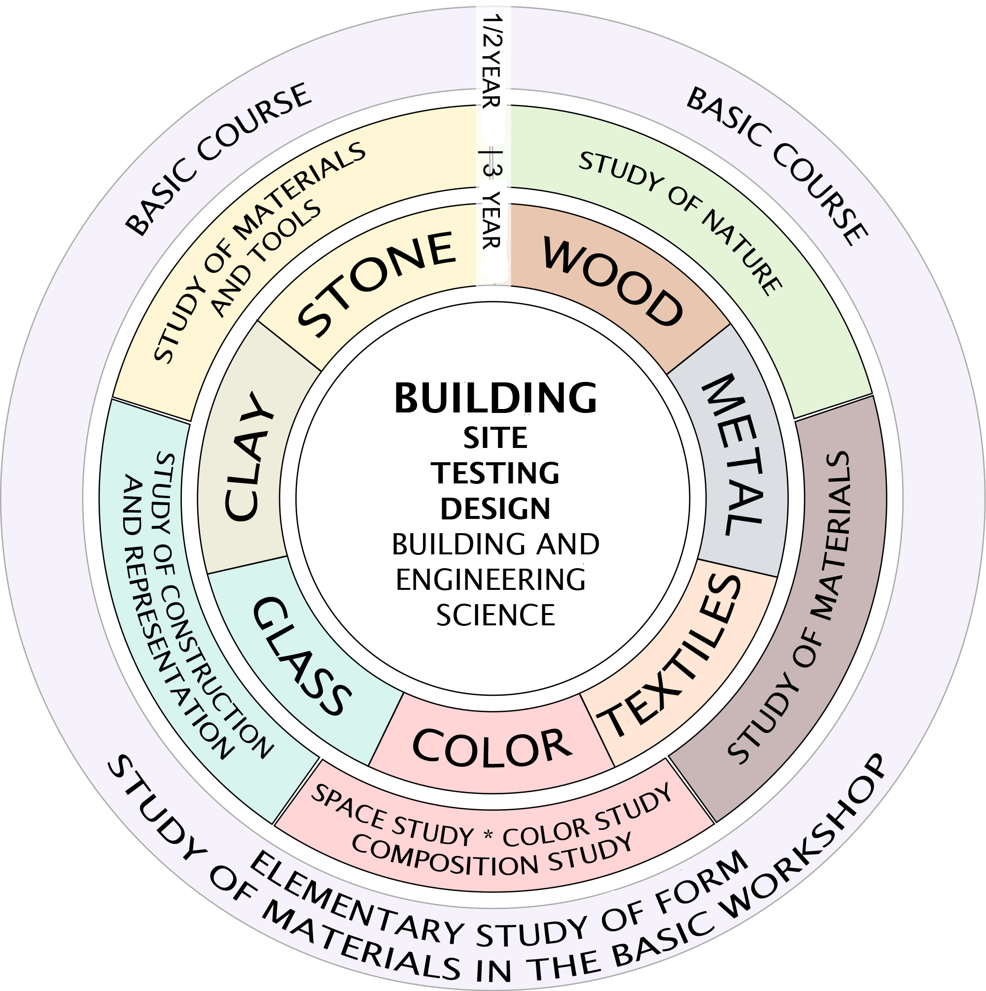
Art education and the “Vorkurs” (preliminary course)
The Bauhaus program of study is diagrammed above as a circle. Students began in the outer ring with the half-year Vorkurs or preliminary course (later expanded to a full year) before moving into one of several workshops to concentrate on a specific medium such as ceramics, woodworking, weaving, metalworking, and so on. Once they had achieved a degree of proficiency in their chosen medium all students converged again in Bau (building), to construct total environments, designing everything from the architecture to the furniture, carpets, dishes, and flatware.
The Vorkurs, which taught skills common to all areas of art and design, was one enduring innovation of the Bauhaus. Today’s art students will recognize in the Vorkurs the progenitor of their first-year 2-D Design and 3-D Design “foundations” courses. The original head of the Vorkurs was a charismatic Swiss art teacher named Johannes Itten, a follower of Mazdaznan (related to the ancient Persian religion Zoroastrianism) who wore monk-like clothing and encouraged students to meditate, do breathing exercises, and eat a vegetarian diet as aids to creativity.
Projects assigned in the Vorkurs were free-form and generally without practical application. They were intended to develop students’ perception, creativity, and understanding of materials. For one typical project Itten collected disparate materials such as wool, rope, and wood shavings.
The students had to feel these sequences of textures with their fingertips, their eyes closed. After a short while their sense of touch improved dramatically. I then asked them to make texture montages of contrasting materials. Fantastic structures were produced and their effects were completely novel at the time.[9]
Experimental constructions
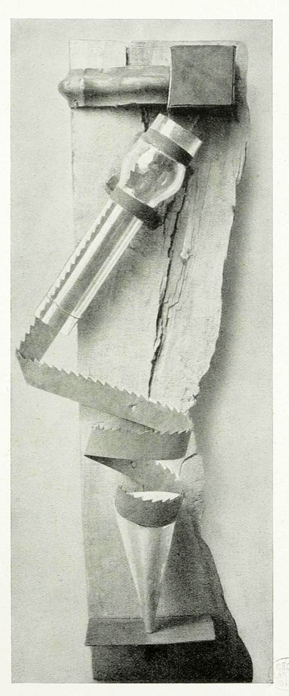
Very few of these Vorkurs projects have survived as they were only intended to be exercises. The work above is described in the 1923 Bauhaus exhibition catalog as a “combined contrast effect: material contrast (glass, wood, iron), contrast of expressive forms (jagged-smooth); rhythmic contrast.” In addition to demonstrating these formal contrasts, its purpose was to understand the nature and potential of different materials.
For example, the wood is left rough and unfinished in order to demonstrate its grain, texture, and color variations. Similarly, the saw blade shows the dull sheen of its surface and has been curled into a spiral to demonstrate the flexibility of metal. The rust on the saw blade’s surface and the knots and splits in the wood are not sanded or polished; instead, they are featured as qualities of those materials that need to be understood by the design students who will be working with them.
From craft to industry
The early Bauhaus concentrated primarily on hand-made crafts, but it soon became evident that, in order to survive, the school needed to reorient its goals toward industrial production. Bauhaus headmaster Walter Gropius asserted in the keynote address for the school exhibition of 1923, “The Bauhaus believes the machine to be our modern medium of design and seeks to come to terms with it.”[10]
Itten, whose spiritual and expressionist orientation did not fit with these aims, was replaced by Laszlo Moholy-Nagy, and later Josef Albers, as head of the Vorkurs. The traditional medieval titles from craft workshops initially used in the Bauhaus, where instructors were called “Masters” and students were called “Apprentices” or “Journeymen,” were replaced by the more modern titles of professor and student.
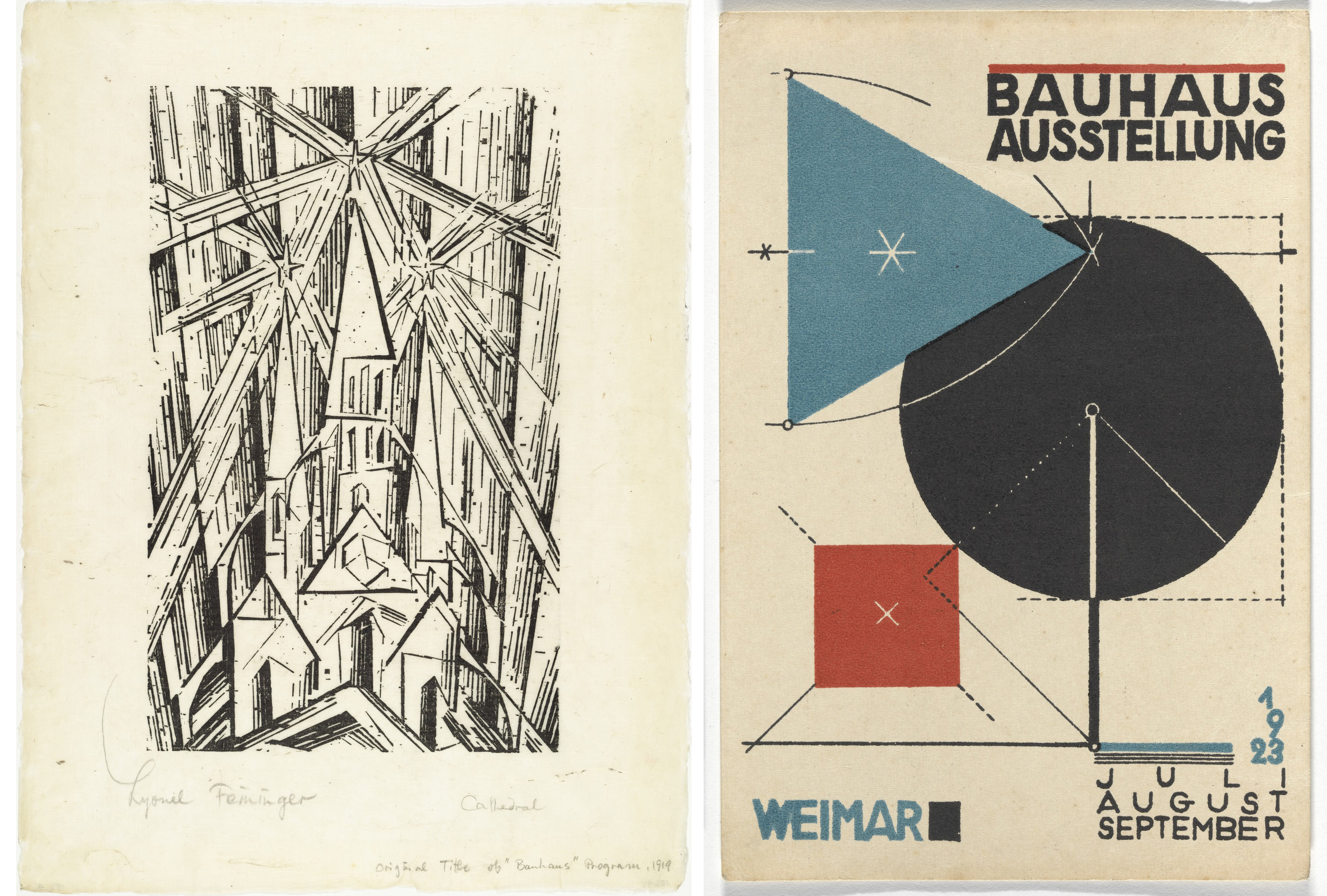
The reorientation toward the modern machine age is most obvious in products designed by the Bauhaus for mass production, but it is also visible in the graphic branding of the Bauhaus itself. In 1919, the founding manifesto of the Bauhaus was published with a cover by Lyonel Feininger that featured a cathedral crowned by three radiant stars. Both the medieval subject and the woodcut technique are deliberately old-fashioned, reflecting the guild structure of the school itself and its emphasis on hand making and personal expression.
By contrast, the poster designed for the 1923 exhibition is a lithograph, a more modern printmaking technology. It uses only rational geometric shapes and the primary colors red and blue, along with black and the white of the paper. Dotted lines and arcs made by a compass reinforce the overall sense of precise, mechanical execution, very different from the uneven, expressive marks of Feininger’s print. Even the letter forms reinforce the impression of clean, rationalized modernity: sans-serif, upright, and with a consistent (monoline) weight. Such “modern” typefaces are very familiar today, but were quite different from the medieval blackletter or gothic typeface that was common in Germany until the 1940s.

- M. H. J. Schoenmaekers, Het Nieuwe Wereldbeeld (Van Dishoeck: Bussum, 1915), pp. 224, 102 (authors’ translation). ↵
- Piet Mondrian, “Dialog on the New Plastic,” De Stijl February-March 1919, in Harry Holtzman and Martin S. James, eds. and trans., The New Art – The New Life: The Collected Writings of Piet Mondrian (New York: Da Capo Press, 1993), p. 77. ↵
- Piet Mondrian, Two Mondrian Sketchbooks, ed. and trans. R. P. Welsh and J. M. Joosten (Amsterdam: Meulenhoff International, 1969), p. 36. ↵
- Michel Seuphor, Mondrian: Life and Work, (New York: Harry Abrams, 1956), p. 73. ↵
- Piet Mondrian, “Neo-Plasticism: The Home – The Street – The City,’ in De internationale revue i10 (Amsterdam, 1927), as translated in Harry Holtzman and Martin S. James, eds. and trans., The New Art – The New Life: The Collected Writings of Piet Mondrian (New York: Da Capo Press, 1993), p. 208. ↵
- Cited in Cees de Jong, ed., Piet Mondrian: The Studios (London: Thames & Hudson, 2015), p. 96. ↵
- Piet Mondrian, “The Realization of Neo-Plasticism in the Distant Future and in Architecture Today,” originally published in De Stijl (March and May, 1922), as translated in The New Art – The New Life, p. 171. ↵
- Piet Mondrian, “Neo-Plasticism: The Home, The Street – The City” (1926), as translated in The New Art – The New Life, pp. 208, 212. ↵
- Johannes Itten, Design and Form: The Basic Course at the Bauhaus and Later (London: Thames & Hudson, 1975), p. 34 ↵
- Cited in William J. R. Curtis, Modern Architecture since 1900 (Upper Saddle River, NJ: Prentice Hall, 1996), p. 193. ↵
a spiritual movement consisting of a highly eclectic mixture of religious, philosophical, and occultist ideas
not depicting recognizable objects. Non-representational art is sometimes described as pure abstraction.
depiction tending toward flattened shapes rather than three-dimensional forms, sometimes to the point of non-representation (pure abstraction)
