I have just finished an essay which discusses the typographical work of Paula Scher. I chose Scher because many of her ideas relating to design practice resonate with my own. I am drawn to the idea that design can have a social impact, and that good design shouldn’t be purely for the elite. Scher feels that good design “should go across the board – advertising, packaging and corporate…because this is the design that most everyday people are exposed to. This is where it is important to create good design – this is a social responsibility”.
Paula Scher: Typography & Environmental graphics from 1970 to the present day
I have chosen to write my essay on the typographical work of Paula Scher. I chose Scher because many of her ideas relating to design practice resonate with my own. I am drawn to the idea that design can have a social impact, and that good design shouldn’t be purely for the elite. Scher feels that good design “should go across the board – advertising, packaging and corporate…because this is the design that most everyday people are exposed to. This is where it is important to create good design – this is a social responsibility”1.
I will explore the career of Paula Scher, with a focus on her work at CBS records, looking at the social, cultural and political influences on her early work. And then move on to her mid-career work at Koppel & Scher, before finally looking at her more recent work since joining Pentagram in 1991. I will demonstrate how Scher’s work has had an impact on the popularity in the past decade of using typography both as image and its use in environmental design.
During the 1960s, when Scher was a college student, the political backdrop was particularly turbulent. She grew up during the height of the Cold War and saw an escalation in the US government’s involvement in the Vietnam war, which had been ongoing since the mid-1950s. It was also a period of general unrest and of significant social changes. The civil rights movement led by Martin Luther King, achieved the passing of the Civil Rights Act in 1964, while the gay rights movement achieved a significant blow to discrimination during the Stonewall riots of 1969.
“It was truly an age of reform and revolution. Over the course of the decade, Congress passed historic legislation transforming the role of government in American society. The Civil Rights Acts of 1964, the Voting Rights Act of 1965… were all part of this legislative record.” 2
Scher was not unaffected by these changes. She attended a rally in Washington and heard Martin Luther King speak. She sat on buses where black people were legally obliged to sit at the back.
In 1970 she graduated from the Tyler School of Art in Pennsylvania, where she studied fine art. Her studies encompassed illustration and graphic design, however Scher states that she avoided doing very much graphic design as she felt she lacked “neatness skills” and at the time the college was teaching how to design using grids, the ‘International Style’ and favoured the font Helvetica. Scher found Helvetica to be a loathsome typeface, she saw it as being used everywhere and believed that it dominated the visual landscape of the US. However there was a political edge to this hatred too. “I was also morally opposed to Helvetica because I viewed the big corporations that were slathered in Helvetica as sponsors of the Vietnam War. So therefore if you used Helvetica you were in favor of the Vietnam War, so how could you use it?” 3. (Fig 1).
This stance firmly against the ‘International Style’ and the use of Helvetica greatly influenced the work she produced after graduating. It can be seen as an intentional reaction against what she felt was a very politicized and domineering visual landscape.
Scher’s first job was working at Random House where she became a layout artist for children’s books. She quickly moved to CBS records to design layouts for the advertising department. In 1973 an Art Director at Atlantic Records saw Scher’s work and asked her to join Atlantic to design album covers. Moving back to CBS a year later, Scher was to go on to design over 150 covers a year for CBS until leaving in 1984.
It was during this period that Scher began to really experiment with typography. She describes herself as being ‘not very good at drawing’, so wanted to see what she could produce by purely using letterforms. Her dislike of Helvetica pushed her to visit antique stores and thrift stores where she would look for interesting typefaces to use in her work. This was before the use of computers and the internet, so all the research and execution was done by hand. Scher states that she wanted to “make work that was entertaining and could also shake things up” 4.
Scher is both referring to the prevalence of the International Style that was in use in graphic design, but also that she wanted to be political – but not in a dull or lecturing way – with the work she produced. Scher’s attitude to design in this period echoes the ‘punk’ ethos in Britain (fig 2) in the mid to late 70s. Punk created work with “a wave of invention, of pillaging history and vernacular without excessive respect… their medium was more about emotion in communication than reason” 5. However Scher’s rejection of the status quo was expressed through play rather than with satire and the underlying anger that was associated with punk in Britain. She used humour and wit to express her disdain.
Scher cites Pushpin Studios as being a big influence in her early career. Pushpin studios were set up in 1954, in New York, by Milton Glaser and Seymour Chwast. Pushpin’s distinctive character as a design studio was to draw on a wide historical background for their visual material: Art Nouveau, Victoriana, and contemporary art. ”In an era dominated by Swiss rationalism, the Pushpin style celebrated the eclectic and eccentric design of the passé past while it introduced a distinctly contemporary design vocabulary, with a wide range of work that included record sleeves, books, posters, logos, font design and magazine formats.”6
Pushpin were very political in much of the work they produced. They were publicly against the Vietnam war and were supporters of the civil rights movement. Works such as the ‘End Bad Breath’ anti-Vietnam poster by Chwast is evidence of this (fig 3).
In order to examine Scher’s experimentation with typography, it is important to look at the early designs she produced for CBS records. Many of the album covers that were being produced in the seventies featured an image of the artist or band and some type. The album cover artwork for King Crimson’s album Red (1974) is typical of many early seventies album covers ( Fig 4). However the designs Scher was producing were very much about typography. They were about using type in an expressive way. They were using type as image. This had of course been done before by the Constructivists and Bauhaus designers ( fig 5), but can be seen as distinctively different from what was being produced by her contemporaries.
This example from 1976 Leonard Bernstein – Poulenc, Stravinsky ( fig 6) clearly shows a strong emphasis on typography; making it the most prominent element of the design. It also demonstrates Scher’s sense of play, through her historical plundering of the Art Nouveau style. She uses the designs in a non-reverential way. Seeing it as a purely another tool in her toolbox. This was a refreshing way of referencing the past and shows a distinctly postmodern feel to her work. This is an interesting aspect of Scher, as she doesn’t associate what she creates with much intellectual thought. She has been quoted as saying that she didn’t even know what postmodernism was at the time.
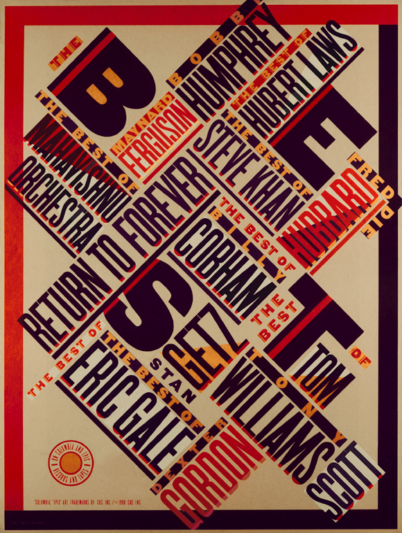
Perhaps Scher’s most well known, and some would say, most dynamic pieces of work was a poster she designed for a compilation record, ‘The Best of Jazz’ in 1979 (fig 7). This poster was handmade by Scher by cutting and pasting and re-sizing the type by hand, using American woodtype. Many people see this work as being directly influenced by Bauhaus and Constructivism, however Scher believes that actually the thing that exerts most influence over her work is where she lives: New York City. Scher describes this piece as being crammed in together like the buildings of New York, with its grids and skyscrapers. The time spent at CBS enabled Scher to ‘play’ with design. This poster is an early example of work where Scher is ‘playing’ with design, and clearly informed the identity work she created for the Public Theater in 1994.
Scher’s playfulness and sense of fun is one of the most admirable qualities of her approach to design. She cites being able to play and to fail as being the most important lesson to learn when becoming a graphic designer “serious design, serious play is something else, for one thing it often happens spontaneously, intuitively, accidentally or incidentally…serious design is imperfect” 7. For Scher ‘serious’ design is when a piece of design has been thought through and played with and the energy of the idea is still present in the finished work. She describes other work as ‘solemn’ work, when the ideas become refined. This can be dangerous for design, because if design becomes too refined, Scher believes, it can become hackneyed and dead. Her goal is to always create serious and not solemn work. However she recognises that when designing for clients, this isn’t always possible, as quite often they will hire her based on work she has already produced and would like her to create similar work for them.
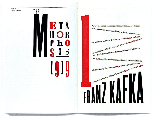
In 1984 Scher set up what she describes as an ‘atelier’ with fellow Tyler student Terry Koppel: Koppel & Scher. During this period Scher worked on corporate identities, advertising and book jackets. In order to generate work for the company, Scher and Koppel designed a handbound book entitled “Great Beginnings” (fig 8). It was purely typographical, using type as image. It looked very similar in tone to early Bauhaus work and also the typographical work of El Lissitsky (fig 9), and demonstrated Scher’s ability to plunder art history and re-work it for her own gains. This ability of hers to re-imagine previous designs from history is perhaps best demonstrated in the now infamous reworking of a Herbert Matter poster from 1934. Scher saw the poster in the offices at Swatch, whom she was working for at the time. She looked at the poster and thought “That poster could use a watch” 8 and so with the permission of the Herbert Matter estate, Scher re-drew the poster, incorporating a Swatch watch. “Scher’s poster continues to provoke discussion because it so tellingly embodies the assumption…that the past is a ‘bottomless pit’ available for postmodern ransacking by designers”9. Scher adamantly denies creating anything in a ‘knowingly postmodern’ way. In her eyes, she began using styles from different historical periods purely as a stance against the ever pervasive International Style.
Shortly before the end of her working relationship with Terry Koppel, Scher was asked by the American Institute of Graphic Arts (AIGA) to design a book cover for their 1989 Graphic Design USA publication (fig 10). When asked if there was a fee for the design, Scher was told that there was only $1,000 for expenses. The expenses would cover illustrations and type setting. This was a period in the US when finances were tight, due to an increasingly volatile financial market. In 1987 the recession brought on by ‘Black Monday’ “was much deeper and longer than expected, and it took much longer to develop than the recession of 1979-82… Unemployment rose steadily and peaked in 1992” 10.
Amidst this economic volatility, Scher was determined to keep the $1,000 for herself. To do this she typeset and illustrated the book herself. It led her to a new moment of discovery in her work. This was the first time she allowed herself to ‘play’ with design in order to fulfil the demands of the client and her own financial needs. The cover was so successful that it won awards for Scher and was a springboard to her being invited, in 1991, to join the prestigious design group, Pentagram. Not only did this piece of work open up new working opportunities for Scher, it sowed the seeds for her Maps project.
As a personal project, Scher decided to experiment with the scale of these hand painted maps, and went on to produce them on a very large scale – the largest being her map of the USA (12 x 9 ft) (fig 11). This experimentation with scale was to move from her personal work into the work she began to produce for clients.
One of her most ambitious design works, particularly in terms of scale began In 1994 when Scher was approached by the Public Theater to design a new identity not only for the organisation, but also for its building. It was to be Scher’s first step into environmental graphics. The theatre’s new director George Wolfe, wanted to create an identity that would feel more inclusive and which would appeal to a wider audience. This commission was a perfect fit with Scher’s philosophy on design. Scher has stated that “my goal is not to be so above my audience that they cannot reach it… It is always my intention to raise expectations of what design can be, whilst bringing the audience along with me”.11
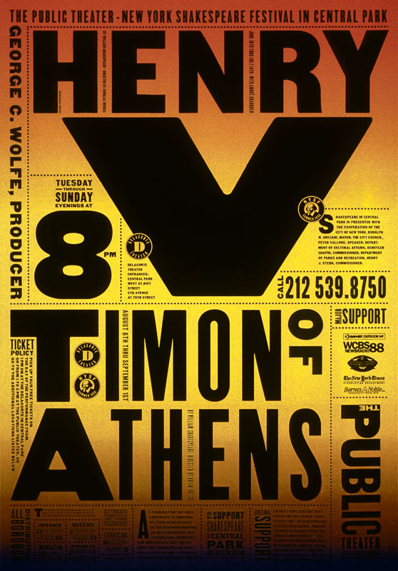
Scher worked for the Public Theater for three years and immersed herself in the project. “I became the voice, the visual voice, of a place in a way I had never done before, where every aspect – the smallest ad, the tickets were designed by me”12. This was a period of growth for Scher, where she was able to ‘play’ and create some ‘serious’ design work. Her posters for ‘Bring in da funk, bring in da noise’ (fig 12) and Henry V (fig 13) are incredibly accessible – using nothing but typography to communicate with the masses. There are no daunting images of actors in Shakespearean costume to frighten off potential audiences. Her posters make Shakespeare look cool and contemporary.
Paula Scher has continued to work in environmental graphics; expressing a love of making typography big – as big as it can get. Typography that can hold its own in a big city like New York. My personal favourite is the work she did for the New Jersey Performing Arts Center (fig 14), who approached Scher with no budget but wanted to update their building and appeal to a wider audience. In painting the building and using large-scale typography, Scher brought the building to life and raised its profile both locally and nationally. “I essentially re-drew the building in typography” 13.
The work of Paula Scher has influenced many graphic designers who are working today. Her work for the Public Theater in New York was much imitated, so much so that Scher had to create a new identity for them as she claimed New York had ‘eaten’ the first one. Her influences can be seen in the work of designers like Craig Ward (fig 15) but also the environmental graphics work created by Cartlidge Levene and Studio Myerscough for the wayfinding system they created for the Barbican Centre (fig 16) and the Design Museum in London. Paula Scher’s influence is far reaching, she has been described as “Iconic, smart and unabashedly populist… her images have entered into the American vernacular”. 14
It was my interest and love of typography which led me to look more closely at the work of Paula Scher, and in doing so I have found her philosophy inspirational. To raise the expectations of what graphic design can be, to continually play with design, and to plunder history using wit and irreverence in order to create new ideas is certainly something worth aspiring to.


