

There were few blank walls and empty surfaces in Milton Glaser’s studio on 32nd Street, where he worked from 1965 until he died in 2020. It was always choked with stuff, a good deal of which he had some hand in creating: mugs emblazoned with the I ♥ NY logo, dozens of Brooklyn Brewery beer bottles, watercolors for a Hermann Hesse calendar, etchings from his time as an art student in Italy. What he was proud of was always within eyeshot. And the rest? “Kind of buried in the basement,” says Beth Kleber, the founding archivist of the Milton Glaser Design Study Center at the School of Visual Arts, where Glaser taught for over 40 years. Since 2003, she’s been cataloguing the “many many thousands” of drawings, sketches, and ephemera that Glaser donated to the school — a project that’s ongoing because there’s simply so much material. During his lifetime, Glaser had moved some of the work from his studio to the SVA archive, but there was even more stuff still stowed away in the studio when he died. Much of it hadn’t been seen until Kleber started opening some of those forgotten boxes.
Surprisingly, most of this was work from early in his career, the era of that Bob Dylan poster and the groovy cover for Tom Wolfe’s 1967 best seller The Electric Kool-Aid Acid Test. While Glaser’s peers were obsessing over grids and rational layouts and limiting themselves to a small number of fonts, he was layering historical references, hand-drawn lettering, illustration, and eye-searing color in maximalist designs. He practically defined the look of the 1960s and 1970s, but he didn’t want the look to define him. “Milton was very dismissive or ambivalent about his work from the time,” Kleber says. “He wanted to move on.” Aside from a couple of ultrafamous works, like the Dylan poster, he seldom included this era in the monographs published about him when he was alive. But Kleber believed more people needed to see these early experiments that brought Glaser so much attention, even if he wasn’t fond of all of it. So she, along with fellow historians and SVA faculty members Steven Heller (who was also a dear friend of Glaser’s) and Mirko Ilić (another close friend and frequent collaborator), decided to highlight these works in their new monograph, Milton Glaser: POP. An accompanying exhibition of the same name is opening on May 17 at SVA’s Gramercy Gallery, which will feature over 130 original drawings, archival posters, and more ephemera.
Ahead of the exhibition’s opening, Kleber shared a few of the rare illustrations, never-produced commissions, and little-seen posters in the Glaser archive.
An Original Cello-tak Collage for the Cover of Tom Wolfe’s The Electric Kool-Aid Acid Test
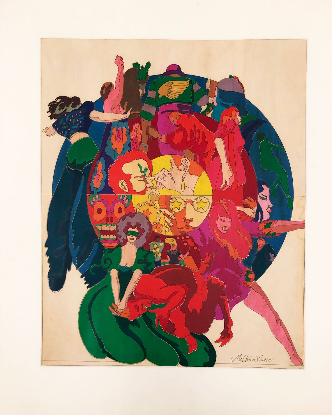

Large swathes of flat, even color defined Glaser’s work from the 1960s, such as in this delirious-looking drawing of the acid era, which he originally designed for a 1967 New York supplement on “The World of LSD” for the World Journal Tribune. To get the look, he used a colored adhesive film called Cello-tak to create the collage.
A Possible Pre-Dylan Illustration
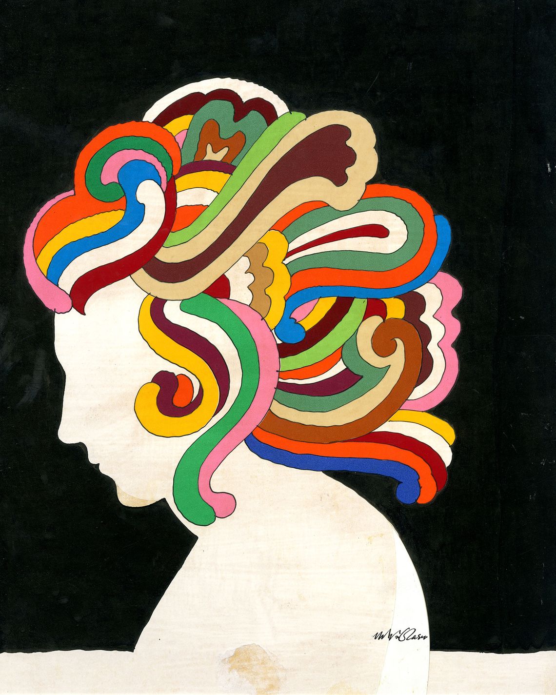
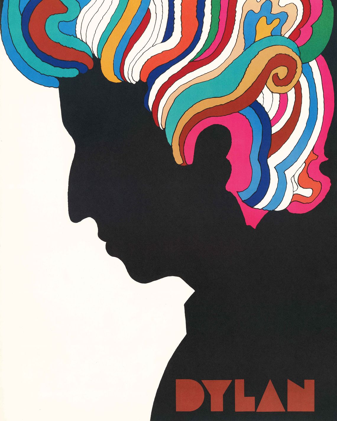
Glaser recycled his work a lot. Variations on the rainbow hair in his 1966 “Bob Dylan’s Greatest Hits” poster also show up in a 1962 cover for Bulfinch’s Mythology and a 1969 pharmaceutical ad for a prescription painkiller. It turns out that the image so closely associated with Dylan didn’t necessarily originate with that project, as Kleber discovered when she found this illustration from the early 1960s in his archive. When she asked Glaser about the unlabeled drawing, he couldn’t even remember where it came from.
Drawings for Early-1970s Fanta Ads


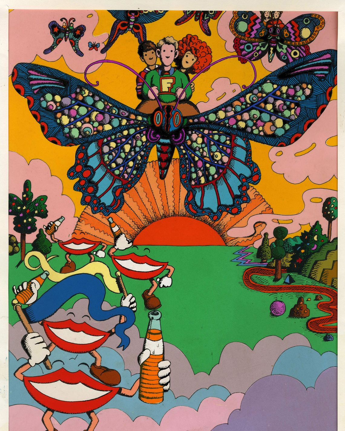
Most of Glaser’s commissions were commercial: book jackets, album covers, posters, and advertisements. He designed this campaign for Fanta in the early 1970s, but the brand never used it. Glaser’s drawings of a couple riding a purple polka-dot elephant, trees playing musical instruments, and grinning mushrooms makes you wonder if the soda’s been spiked with something a little more mind-altering.
A Nod to Thomas Gainsborough in a Lincoln Center Poster
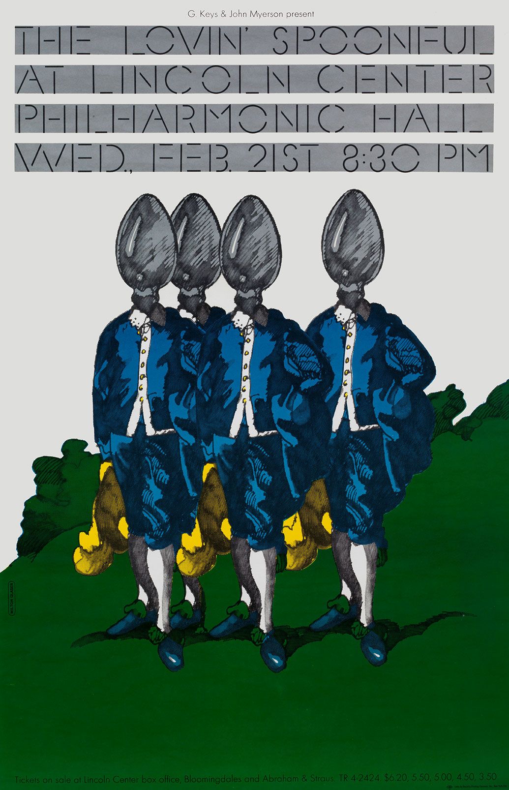
Like the postmodernists who sampled classical architecture in their buildings, Glaser winked at art history often. For this 1972 Lincoln Center ad for a Lovin’ Spoonful performance at the Philharmonic, he quoted Thomas Gainsborough’s ultrafamous 1770 portrait The Blue Boy but replaced his head with a spoon.
A Phone Book for Manhattan


Remember phone books? Glaser designed one for Manhattan in 1971. Around the time, the New York Telephone Company decided to go all in on psychedelia and commissioned covers from artists like Peter Max, Doug Johnson, and Glaser. Kleber points out that Glaser’s cover — which sort of looks like a doodle — has all of his favorite motifs: strange things coming out of trees, eyeglasses, wings, and animals. “Manhattan Yellow Pages” is also done up in his Baby Teeth font, which was inspired by a sign he saw in Mexico.
Posters for Hair


During his pop era, Glaser often designed bespoke fonts for his clients, which were weapons in his “battle against the clinical look of the moderns,” as Kleber and her colleagues write in Pop. For example, his never-produced designs for the 1968 Broadway show Hair feature blocky letters with hair growing out of them.
A Puzzle Announcing an SVA Symposium on “The Art of Seeing”


Glaser wasn’t a snob. “He generally thought if it takes somebody longer than like a few seconds to figure out what you’re doing, then you’ve lost them,” Kleber says. He designed this invitation to an SVA symposium on “provocative visual material and commentary” as a sort of Rorschach test. The abstract shapes printed on the note cards could be interpreted a number of ways, but there are some obvious anatomical associations. “It’s like a teeny-tiny puzzle, like I <3 NY,” Kleber says. “There’s just a moment before you say, I’ve got it.”
“Milton Glaser: Pop” opens at SVA’s Gramercy Gallery (209 E. 23rd Street) on May 17.


