Review
Paula Scher
Site-specific installation of a graphic-great's typography
Die neue Sammlung – The Design Museum Pinakothek der Moderne, Munich, Germany. Exhibition until 22 September 2024
Type Is Image
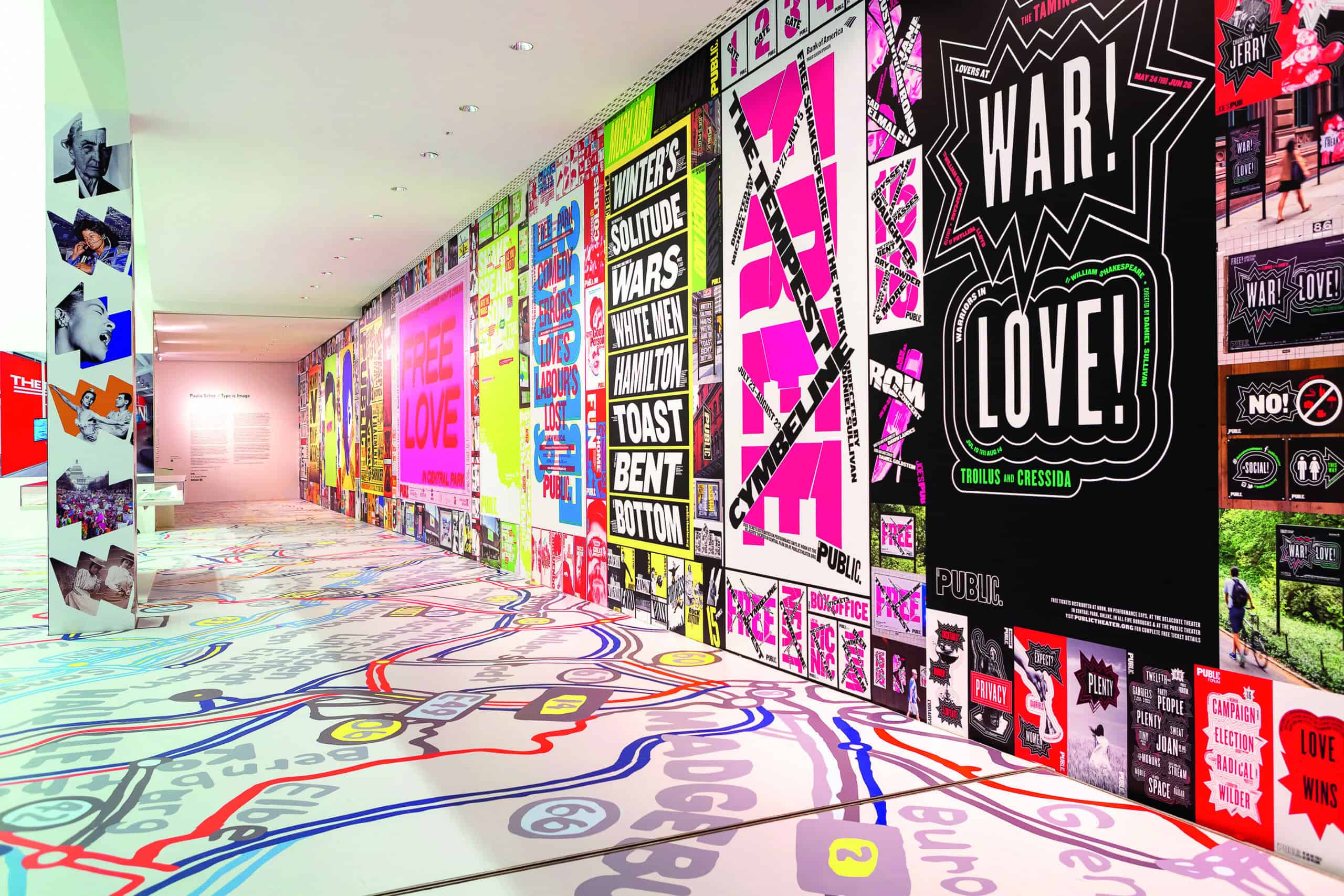
This specially commissioned site-specific installation is something to get on the itinerary, for anyone who cares about graphic design and wants to appreciate one of the leading practitioners of the last 50 years. Paula Scher has been known for her typographic inventiveness from … well, a long while back.
Born in 1948, she’s a great American graphic designer who seems at her very best when she really gets to play with type. She gets it to sing and dance in ways that others can only, well, copy. So a little homage is appropriate. The exhibition features both much commissioned work from across her career as well as a range of non-commissioned work. Besides the sheer mastery and beauty of many of the pieces incorporated, it also goes through the emotional gears. It can be really serious, with big issues tackled head on, and yet also be handled with great charm.
A lot of the work is also truly entertaining and fun. All of this with typography a key, if not leading, element. In how the letters leap around, it is like watching really good dancers, Fred Astaire and Ginger Rogers say, strut their stuff. Just a real pleasure.

Paula Scher, Environmental Work for the New Jersey Performing Arts Center, Detail, 2001. Photo: Peter Mauss.
Top time: Exhibition view. Photo: Die Neue Sammlung – The Design Museum (Anna Seibel)