
Microsoft has an annual turnover of over $100 billion. Its co-founder, Bill Gates, is one of the richest businessmen in the world: there’s even a game called Spend Bill Gates’ Money that invites people to fantasise over the purchases they could make with his endless wealth.
Today we’re going to look at Microsoft’s logo, and how it has evolved over the years. It has actually changed a great deal since the firm’s early years, including some slightly bizarre and little-known redesigns.
Microsoft’s story
Microsoft’s story is too long to be summarised in a single paragraph, but it’s also too fascinating not to be aware of. I’d therefore recommend doing your own research through Microsoft’s incredible archive videos, which provide a behind-the-scenes look at the company, year after year. It all began in 1975, when Bill Gates and Paul Allen founded the Microsoft Corporation and launched a new piece of software (BASIC) that was compatible with the first ever personal computer, the ALTAIR 8800. And that was just the first chapter in what became a truly epic story.
How the logo has evolved
The Microsoft logo has taken a long and circuitous route to the visual identity we know today, particularly pre-1987, where a more recognisable logo was finally established. Before the Microsoft Corporation was founded, the business was called Traf-O-Data, and sold a computer that could process the raw data generated by traffic counters. This is where our journey begins.
1972: the Traf-O-Data logo
The Traf-O-Data logo was designed in 1972. The monogram is fairly simple, comprising three black figures recalling the initials of the name: T, O (the white circle) and D. The initials are followed by the company’s full name, written in a rounded, friendly-looking font.
1975: the very first Microsoft logo
In 1975, the business changed its name, and designer Simon Daniels created Microsoft’s first logo: a monochrome design featuring large letters formed from numerous lines that get gradually thicker. If you look carefully, you’ll notice that the spacing between the letters (the kerning) is not always even.
We could call it a ‘fashionable’ logo: it has a definite 1970s look, and today it looks extremely retro.
1980: the metal logo
Take a look at this logo: when you see the bold letters of the New Zelek typeface, what is the first thing that comes to mind? For us it’s the Metallica logo, and more generally 1980s heavy metal. Once again, Simon Daniels designed a logo that was closely linked to the trends of the time, and therefore destined to be short-lived. Very short-lived, in fact: it only lasted two years.
1982: Daniels’ third logo
Fashions come and go. So when Simon Daniels redesigned the Microsoft logo for the third time, he went for a balance of sobriety and creativity: a sans-serif typeface with a streamlined, simple design, but with the central O filled with concentric circles and horizontal stripes, making it look like a CD, a steering wheel, a rising sun or perhaps even a lens. What do you see?
1987: a more recognisable logo
In 1987, the logo began to become more recognisable and iconic. The person responsible for this redesign was Scott Baker, who created a very simple, legible logo, easily reproducible, in italicised Helvetica Black. A hint of creativity can be seen in the triangle cut out from the letter O, which gives the logo movement and dynamism: this element earned the logo its ‘Pac-Man’ nickname.
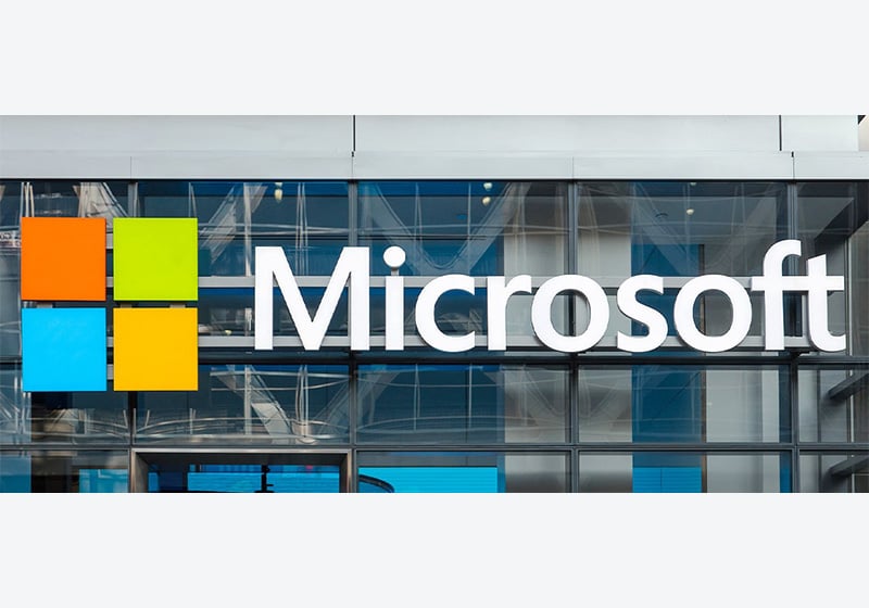
Since 2012: the logo we know today
In 2012, the logo changed again during a major rebranding operation at the business and subsequent revamping of its visual identity. The new logo, designed by Jason Wells, as well as the logotype (in the sans-serif font Segoe UI Semibold) also features a geometric image of four small coloured squares, which together make up a single, larger one. The innovation here was the introduction of the primary colours, each one representing a different service offered by Microsoft.
We’ve arrived at our destination. See you soon for the next chapter of #BrandVolution. If you want to explore more of our stories, simply search for this hashtag in the blog’s search bar.