Graphic design and painting might seem to some as distant fields of art but the truth is that artists from both sides face the same artistic problems, for instance: balanced composition, colour, scale, dominant etc. In history of art, there are instances of artists who practice completely different art styles and yet create very similar projects. Today, in this regard, I’d like to take a look at works by two famous artists: French painter Henri Matisse and Paul Rand – American graphic designer nicknamed ‘papa logo’
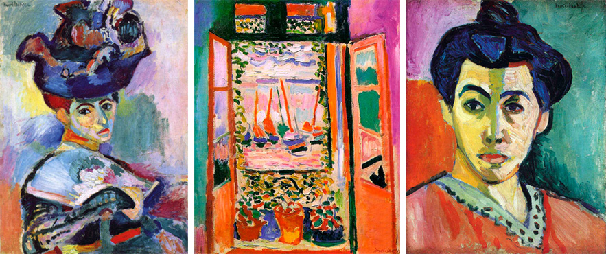
Matisse was one of the main representatives of an art movement called fauvism. Fauvism began in 1905 and was also the beginning of avant-garde revolution in art. Main characteristics of fauvist paintings are: bright colours, simplified form, deformation of shapes and colours. The matching of vibrant colours was absolutely spontaneous , which is confirmed by Matisse in his speech from 1907: “My choice of colours does not rest on any scientific theory; it is based on observation, on sensitivity, on felt experience”.
Here are some of Matisse’s pieces from that period:
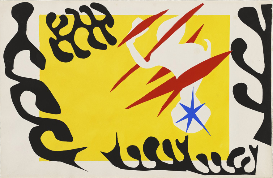
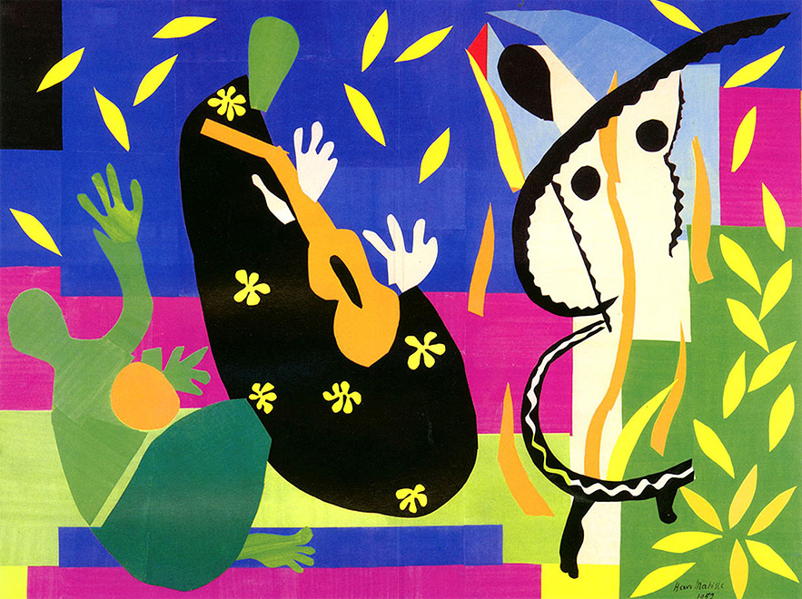
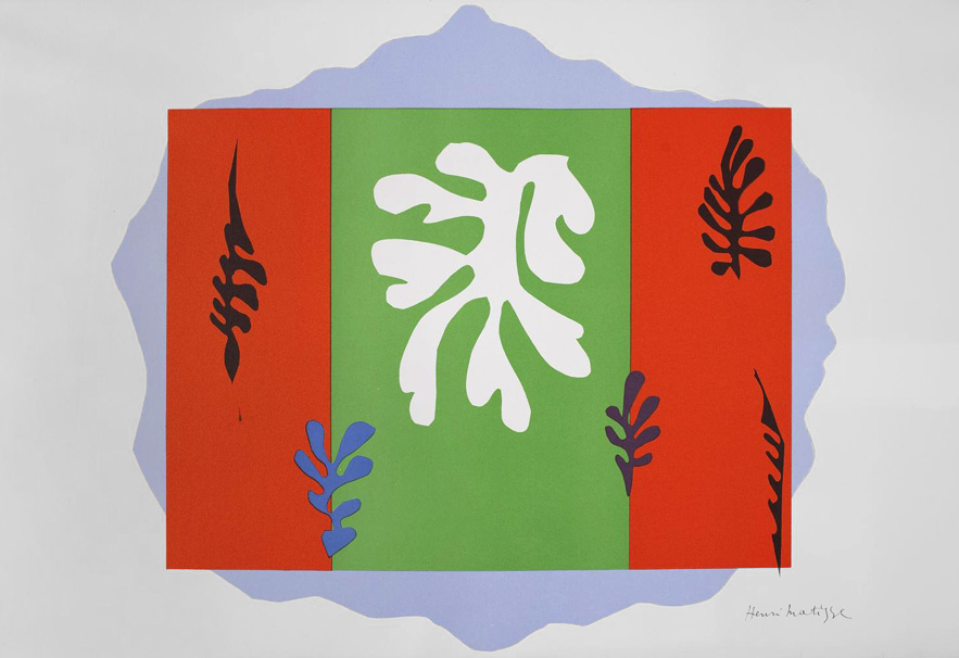
His later works were significantly calmer. Flashy combination of colours and thick textures gave way to elegance and subtlety of soft lines; from fauvism the artist preserved the purity of colours. Matisse’s pieces always were cheerful in expression, although their form changed as the time passed. In his later years, due to illness, Matisse could no longer work with easels and was forced to change his technique. He started to practice cut-outs, and this is when – in my opinion – his most interesting pieces were created. Their form was much simplified but the cheerful mood, vibrant colours and perfect composition stayed intact. Scale and size of these works are also very effective. These pieces were created mostly in large dimensions.
Here are some examples of Matisse’s cut-outs:
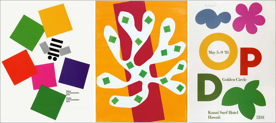
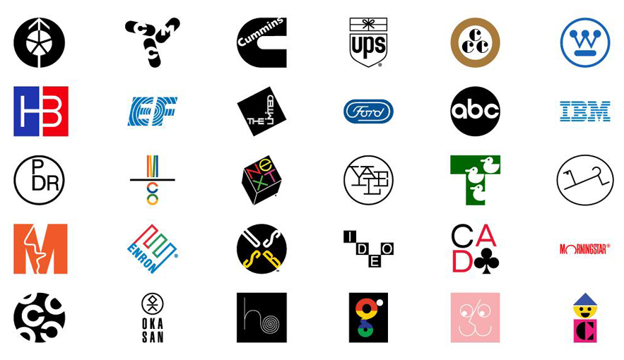
What Matisse has to do with the famous logo designer? Let’s start from the beginning, as Paul Rand’s art path is complex and multithreaded. He is of course best known for his logo designs (hence his nickname ‘papa logo’). He designed signs for such companies as: IBM, Enron, NEXT, UPS, and even new logo for Ford (although in the end it was not used). Logos created by Paul Rand are light, clever, rescale well and look just perfect on various products.
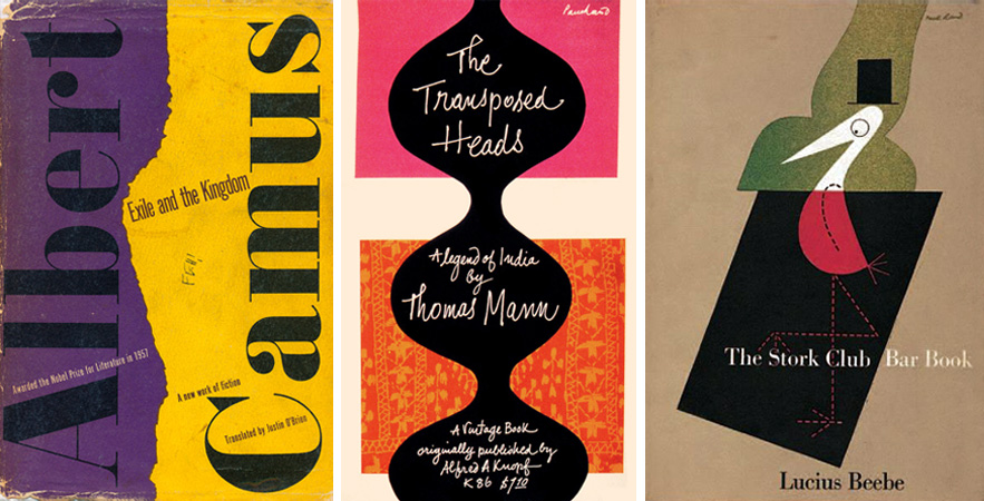
Apart from logo designs, Paul Rand created hundreds of book covers and posters. This part of his career is especially close to my heart and I think his book covers are ones of the best in the world. They are characterized by much freedom in composition and colour palette. In many of his pieces, the artist combines simple, sans-serif typography with ornamental, hand written calligraphy, maintaining the right proportions. All projects by Rand are characterized by simplicity but none of them is boring.

Just like Matisse, Paul Rand had an exceptionally keen eye. His designs distinguish themselves with perfect precision and balanced composition. Despite the already mentioned freedom in choice of colours and seemingly randomness, no element in any of his projects is random. Everything is set in the best possible position. Each composition is well thought-out in the tiniest detail – including the place for artist’s signature. Take a look at this project:
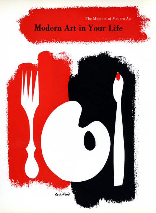
Despite the asymmetry the left side of the image is balanced with the right side. The balance is felt also in the finish of edges of elements – spots of colour are soft, with traces of brush strokes, while the rest is sharp – as if cut with scissors. The perfect balance can be also seen between elements covered with paint and the white background. If we were to imagine a scale on which we could put on the one side all printed parts of the image and on the other side the background (non-printed parts), then both sides would align.
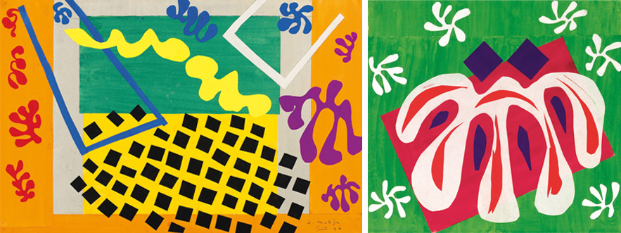
Masterfully balanced composition, simplicity of forms, the use of austere, pure colours and the technique of cut-out and collage makes the artworks of both artists visually coherent. Here are examples of Paul Rand’s pieces visibly inspired by Matisse’s creations:


text by Anna Klos
translation by Karolina Klos
Pingback: Self initiated project – Research – e
Pingback: PAINTING – Emilie Meyn