
D uring the early 1960s, capitalizing on his successes, Willem de Kooning designed a spacious new studio-residence in the community of Springs, near the eastern tip of Long Island. By 1964, he was comfortably at work in the pastoral surroundings that reminded him of the Dutch landscape of his youth—open sky, open water, brilliant atmospheric light. The sensory environment was just as rich, and potentially just as dense, as what he had appreciated in the crowded streets of Manhattan. He noticed all the details, wherever he was.

As de Kooning was settling into Springs, Susan Sontag was composing “Against Interpretation,” the essay that brought her early fame. It advocated “an erotics of art,” a remedy for the prevailing “hermeneutics,” the science practiced by critical interpreters. “We must learn to see more,” Sontag asserted, suggesting that sensation itself should guide the appreciation of art even among theoretically oriented writers. Her paradigm case was de Kooning. As the lead-in epigraph to her essay, she quoted his quip, “Content is a glimpse.” The remark implied that the slightest sensory phenomenon could generate meaningful, memorable art. Many of de Kooning’s statements seem to anticipate Sontag’s critical division of “erotics” (engaged sensation) from “hermeneutics” (interpretive thinking). “I don’t paint with ideas of art in mind,” de Kooning said in 1959: “I see something that excites me. It becomes my content. ... I have a vague idea[…]that’s a kind of image. As I paint, I find out what the clear idea is.” [i]

So much aesthetic philosophy, so much philosophy of life is contained in de Kooning’s witty proposition: “I find out what the clear idea is.” A “clear idea” is not a thought but the immediate sensation of a continuing process: as he paints, he says, he finds out. The idea de Kooning sought was not something with the precision of a square or a circle; it was instead more like a square that could be mistaken for a circle, a square becoming a circle. He valued ambivalence and doubt in sensation, the excitement of exploring the full sensory range of a color or a form derived from ongoing observations. Neither the observations nor the forms would ever stabilize. “...when I am slipping, I say, ‘Hey, this is very interesting.’ It is when I am standing upright that bothers me. ... I’m really slipping most of the time into that glimpse. That is a wonderful sensation.” [ii]
De Kooning’s glimpse was Sontag’s eroticism.

De Kooning’s paintings challenge our sense of what a coherent image, a finished work, can be. The representation of figures and environments in his art generates endlessly evocative abstractions of shape and color. Maintaining the two critical categories, representation and abstraction, becomes irrelevant to “seeing” the images that de Kooning generated. Forget about categorical, analytical thinking; it will block access to the utter fluidity of de Kooning’s forms. They change even as our gaze fixes on them. We are transfixed not by the stable perfection of each of his paintings, but by our realization that each of his images is many images. De Kooning’s changes, the internal tensions in his art, alter our habitual mode of seeing, as only the most powerful aesthetic gestures can.
In his Long Island studio, de Kooning’s central theme of “Woman” shifted from urban types to suburban or exurban types—primarily figures at the sea, some reclining on beach chairs, some in sun dresses, some in recreational boats—all abstracted through the painter’s sensuality, a force to generate both form and deformation. De Kooning so closely identified his own physicality with the forms he observed that he would mimic the shapes while rendering them, assuming the posture of the other (whether a person or an object). In his art, the “erotics” of everything became the sensuality of paint on canvas, paper, or board. In Montauk II, try following some of the deep violet strokes that twist into the articulation of figures, as if forming their contours; it will be hard to keep an eye on the figures and not on the sensuality of the line itself. Follow the line. You will feel the specificity—but also the multiplicity—of de Kooning’s sensation.

Montauk II (1969), Untitled (c. 1979), and The Hat Upstairs (1987) are among the treasures that Lisa de Kooning, the artist’s only child, chose for the family collection, to represent the creative life and soul of her father. The three paintings span the course of the artist’s Long Island period, the decades of the 1960s, 1970s, and 1980s. Each work epitomizes a stage in the evolution of de Kooning’s aesthetic orientation: the concentration on figures, characteristic of the 1960s; the broadly brushed works of the 1970s, evocative of landscape and atmosphere; the bold linear and chromatic essences that define the “late” style of the 1980s.

De Kooning painted Montauk II on two sheets of paper of equal dimension, presumably from the same roll, joined simply and efficiently with masking tape to form a painting surface nearly square; he applied his paints over the horizontal seam, which remains visible as a pentimento, an effect common in the works of the 1960s. He preferred slick, hard surfaces as supports for painting; because paper lacks the material resistance (the “tooth”) afforded by the texture of a canvas weave, it facilitated the fluid type of marking that de Kooning took delight in executing, as he articulated forms with strokes capable of abrupt changes in direction and speed. His marks acquire liquidity, as if drawn through water or even air. Once he had become satisfied with a particular composition, the paper surface could be adhered to a stretched canvas or panel. Along the way, as he worked wet into wet, de Kooning typically masked, blotted, or rubbed areas of the surface, not only to adjust details but also to introduce a range of unusual effects. Every stain, spatter, blotch, or transfer (caused by one paint surface touching another) became of interest to him, with each of these by-products of his process adding to the expressive force of the whole. In the upper left of Montauk II, some masking and rubbing, probably with a sheet of newsprint, creates an effect of blur as well as abrupt breaks in some of the linear strokes. In the lower left of the composition, the paint is imprinted with a fine pattern, indicating that de Kooning used textured paper toweling as a blotting and drying aid. This great variety in marking served his sensory interests.

To my eye, Montauk II contains three figures or bodies, defined by their dark external contours, mostly violet, and light-valued interiors, either white or pale yellow. At least two are female, and they happen to have at least three legs apiece, the result of typical changes in de Kooning’s process of locating and articulating the form. The sex of the third figure is ambiguous. The easiest body to perceive is the largest, oriented diagonally, with legs at the bottom center and bottom left of the compositional surface, and its head at the right center. I think of it as a figure reclining in a beach chair, perhaps wearing a sun hat. De Kooning made many drawings of this type of “Woman.” The figure is demonstrably female because its pubic area is defined by a graphic configuration that de Kooning often employed in this decade—a J-form coupled with a reversed J-form. This was the artist’s shorthand for both vulva and buttocks. A second female figure (female by the same graphic indication) exists to the left and above the larger one. This second figure intersects with the third one, oriented horizontally, parallel to the top edge of the composition. It’s unclear to me what the sequence of establishing these figures might have been. What I’m calling the third figure might have been the first, especially if de Kooning had begun painting with the format rotated ninety degrees around. Whether working on the studio floor or with the paper taped or tacked to the wall, it would have been easy enough for the artist to approach the composition from any edge or to change the orientation of the working surface by turning it; he often did such things. The third figure could be prone, like a person sunbathing on a beach. With rotation, it could be standing.

Given de Kooning’s interest in, his excitement over, the turns of his brush and the subtle differences between colors that are stains, colors that are smears, and colors that are textured accumulations, why include figures at all? There are several reasons. De Kooning was very much an empirical observer—a realist. He virtually always had some external observation in mind while he worked, no matter how submerged in paint his “reality” might progressively become. Paint, after all, was its own reality, its materiality to be acknowledged and respected. De Kooning internalized many of the bodies and scenes that intrigued him; he could work from memory and allow some favored sensation to regenerate itself as a new composition. He remarked that an artist had “to start somewhere” [iii]; he used elements drawn from his mental store of figural images as a device to inaugurate a canvas or reorient it as it was progressing. A de Kooning “start” can occur at the beginning, the middle, or even the end.
During the 1970s, de Kooning’s paintings most often continued to have an origin in bodily configurations, whether observed, imagined, or derived from tracings or transfers of fragmentary elements of an antecedent work. These various “sources” facilitated the artist’s venturing into unknown pictorial territory. They jump-started each blank working surface, providing an initial movement or contour, the beat of an incomplete rhythm, a challenging feature of coloration or design. It was as if each painting de Kooning made was the germ of another painting. Each work acquired its uniqueness while belonging to what became a very large family of relations.

Untitled, from the end of the decade, presents a deceptively uniform appearance. At a certain distance, the canvas may appear like a study in wavy motion, primarily blue, therefore evocative of the sea. From less of a distance, the image seems far more complicated, an array of horizontal movements with many hints of vertical counter-movement at the lateral margins and down the central axis; some of the phantom verticals are residues of the lifting of a scraper at the termination of its passage through wet paint. Blacks and whites, yellows and greens (probably created by mixtures of blue and yellow) compete with the dominant blues for the focus of the eye. Bits of red, the scraped residue of a previous day of painting on the same surface, provide chromatic counterpoints to the blues, greens, and yellows. Along with his brushes, de Kooning used various metallic scraping devices to spread the paint and to thin it when it became too much of an accumulation. Scraping created the ridges of paint seen along the edges of prominent horizontal strokes, enhancing the tactile attraction of the surface.

Untitled is typical of works of the 1970s in appearing layered, thick over thin. With great manual dexterity, de Kooning created a remarkable degree of variation in effects of texture, both material texture and what might be regarded as chromatic texture. Across the surface of Untitled, he mixed his blues with both white and black and mixed his yellows with both blue and black. What results are strange harmonies that impress the eye as more assonant than sonorous—an organizing principle that dances on the edge of visual incoherence, just where de Kooning wanted to be (“…when I am slipping, I say, ‘Hey, this is very interesting.’”). The sense of water to be perceived in the waves of blue in Untitled may be reinforced by the evocation of the blue waves of the Atlantic; but it derives more directly from the physical liquidity of de Kooning’s materials—the waves he felt in his hand and in his body as he painted.
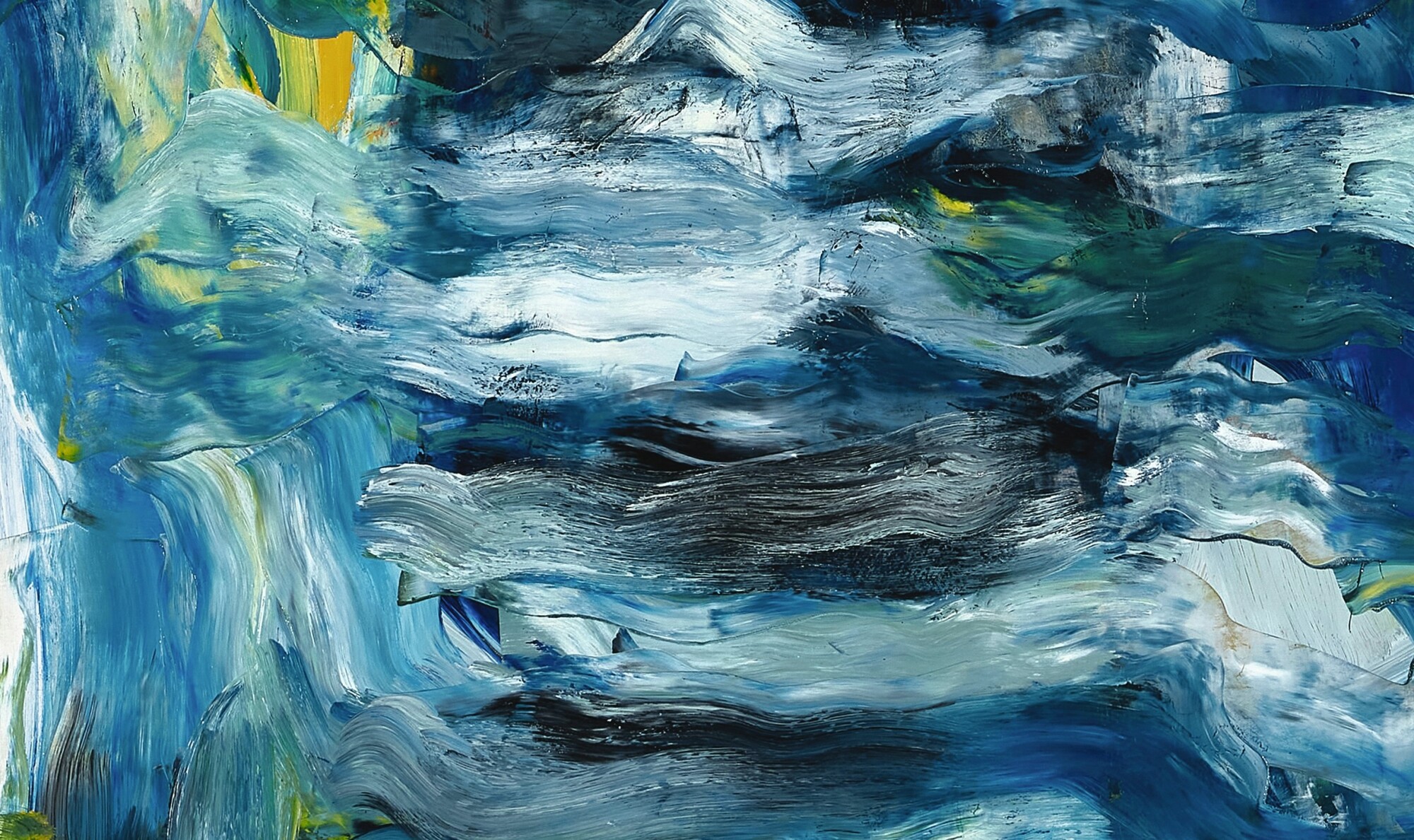
From the wealth of sensory phenomena generated by the life around him, de Kooning abstracted the phenomenological essences. He lived the effects that he rendered. To put it another way, Untitled conveys the erotics of the artist’s Long Island experience, both outside the studio and within it. Untitled teaches us to “see more,” as Sontag had argued that we must. De Kooning’s art causes us to feel—in imagination, if nowhere else—what he felt. I think that we feel it not only imaginatively but bodily.
Not long after the time of Untitled, de Kooning developed what was—by his standards, at least—a less complex approach to achieving a satisfying composition. His abstractions remained just as energized and provocative, but he simplified his means, working on canvas prepared with a white ground and reducing his palette to a few pigments, sometimes as few as two colors in addition to the white. He retained his characteristic movements or gestures, derived from his years of observation of bodies and other objects. His colors assumed the form of twisting ribbons or bands that might seem at once curved and angled. Close inspection of his works of the 1980s, reveals how complex his sense of form and composition remained, despite what at first might seem like severe reduction. For example, he often tinted the areas of white ground along the edges of his opaque bands of color. He also painted the bands both from the outside of the edge and from the inside of the edge, making successively refined adjustments. This technique was a residue of his early experience being employed as a commercial letterer for signage; he could achieve a precise configuration by this manner of gradual adjustment without needing to render the curves of lettering perfectly at a first stroke.

The Hat Upstairs, painted in 1987, consists of colored bands or strips that sometimes run parallel to each other and sometimes intersect with abruptness. The bands are themselves heavily worked, not only by being adjusted from inside and outside their contours but also by being overpainted numerous times, as de Kooning refined his choices of color in particular areas of the configuration. Some of the more unusual hues in this painting appear to be compounds created by mixing one color into another, pressing hard into an existing deposit: an off-green is the result of blue rubbed into yellow, with perhaps a touch of red; a flesh-like hue is the product of yellow and white rubbed into red. An area adjoining the right margin of the composition has a distinctly muted or neutralized coloration, most likely derived from mixing white and all three primaries—red, yellow, blue—in different proportions. The relatively neutral tones contrast with the more strident, saturated colors, introducing an effect of optical depth in what might otherwise appear as a flat graphic design. During this decade, de Kooning used a finely woven cotton canvas while backing it with a thin panel placed between the stretched canvas and the stretcher or chassis itself. This type of support allowed him to use a relatively stiff brush to press paint firmly into areas of his composition without fear of damaging the surface.

Perhaps even more than in the case of the works of the 1960s and 1970s, the works of the 1980s were inspired—“instigated” might be the better term—by de Kooning’s muscle memory of all the elements of figuration he had articulated during his decades of studio practice. He kept a number of drawings that were of special interest to him and also used translucent vellum to make tracings of motifs taken from his own art. This material store of “memory” supplemented his mental and imaginative store. As one studio assistant from the 1980s remarked, de Kooning was “breathing out” paintings like The Hat Upstairs, works that seemed to capture in the artist’s present moment so much of his past aesthetic life—his erotics, past and present.

There was always a light side to de Kooning. I don’t know how The Hat Upstairs got its curious title. The phrase might simply have become associated with the painting when de Kooning or someone else in the studio distinguished a “hat upstairs” from one somewhere else. Perhaps there is an explanation lurking in the de Kooning documentation. I prefer to let the title remain mysteriously suggestive, just as The Hat Upstairs, the painting, is suggestive. It doesn’t represent a “hat”; it doesn’t move like a hat; yet it opens onto such a broad range of sensory engagement that it could represent, or feel like, just about anything.


[i] Irving Sandler, typed notes of interview with Willem de Kooning, June 16, 1959, Irving Sandler papers, 1914-2000, Box 6, Folder 8, The Getty Research Institute, Los Angeles, Accession no. 2000.M.43.
[ii] Willem de Kooning, Kenneth Snelson, Michael Sonnabend, and Robert Snyder, “Inner Monologue,” Summer 1959, recorded conversation transcribed by Marie-Anne Sichère.
[iii] Harriet Janis and Rudi Blesh, De Kooning (New York: Grove Press, Inc., 1960).
