Does the Toyota logo really contain a hidden message?
Car logos are often among the most recognisable in the world, and Toyota's is no different. The three-oval design is, at first glance, pretty simple. But as social media likes to remind us every few months, there could be a little more to it than meets the eye.
Many famous logos contain hidden messages – we'll never forget the first time we saw the arrow inside the FedEx logo (currently top of our list of the best logos of all time). It seems the three ovals within Toyota's current logo, introduced in 1989, can spell out every letter of Toyota (with the help of a little creative highlighting). And once again social media users are declaring themselves "today years old" when realising the supposed secret.
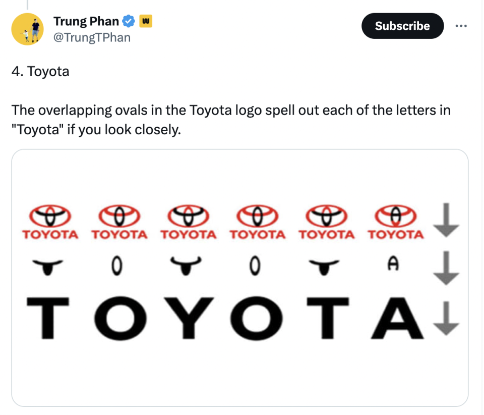
Some of the letters are more obvious than others – the outer ring makes a convincing 'O', while it's not hard to see a 'T' inside the two inner ovals. Others ask for a slightly bolder stretch of the imagination, such as the 'A', which requires you to completely disregard the bottom of the centre oval.
Just saw this. Toyota logo contains the word Toyota in it.#toyota pic.twitter.com/bYxVZ8wIEEApril 2, 2021
Sadly, we're inclined to agree with the many Redditors who don't believe this was entirely deliberate. In a blog post explaining the history of the logo, Toyota only acknowledges the letter 'T': "the inner ovals symbolise the heart of the customer and the heart of the company, overlapping to represent a mutually beneficial relationship and trust between the two, as well as forming a ‘T’ shape for Toyota". As for the rest of the letters, it seems they're not officially part of the design.

As one Redditor comments, "Logos are like finding shapes in clouds. Look hard enough and you see what you want to see". Still, it isn't unusual for logos to contain genuine hidden messages (did you know that the smile below the Amazon logo is also an arrow that points from A-Z?). Check out our logo design inspiration guide for more ingenious examples.

