Jeffrey Smart: Unspoken - The University of Sydney
Jeffrey Smart: Unspoken - The University of Sydney
Jeffrey Smart: Unspoken - The University of Sydney

Create successful ePaper yourself
Turn your PDF publications into a flip-book with our unique Google optimized e-Paper software.
Front cover: <strong>The</strong> Bicycle Race III 1967 (detail)<br />
Title page: <strong>The</strong> Golf Links 1971
JEFFREY SMART<br />
UNSPOKEN<br />
CURATED by POWER PROFESSOR MARK LEDbURy<br />
UNIVERSITy ART GALLERy<br />
THE UNIVERSITy OF SyDNEy<br />
1
Coogee Baths – Winter 1962
‘GREAT MAGICIAN WITH YOUR MUTE COMPOSITIONS’<br />
JEFFFREY SMART: UNSPOKEN<br />
POWER PROFESSOR MARK LEDbURy<br />
JEFFREy SMART HAS bEEN PAINTING FOR SEVEN DECADES. His remarkable oeuvre is as<br />
compelling as it is perplexing, as playful as it is precise, as murkily complex in its effects and meanings as<br />
it is preternaturally clear in its geometries and outlines. <strong>The</strong> <strong>University</strong>’s rich collection <strong>of</strong> <strong>Smart</strong>’s work<br />
is an extended snapshot, mostly dating from the <strong>Sydney</strong> moment <strong>of</strong> the late ‘50s and early ‘60s that<br />
gave us Cahill Expressway (1962) – the ‘breakthrough moment’ that established <strong>Smart</strong> as a painterly<br />
force. <strong>The</strong> collection extends to the period <strong>of</strong> the mid–‘70s in Italy, which saw <strong>Smart</strong> confidently<br />
constructing that seductively familiar yet fiendishly complicated visual universe that he has continued<br />
to inhabit to this day. <strong>The</strong> collection mostly came thanks to the generosity <strong>of</strong> Alan Renshaw, a lawyer,<br />
collector and friend <strong>of</strong> many artists, including <strong>Smart</strong>, who recalls in correspondence hair-raising rides<br />
in Renshaw’s antiquated car, the passengers obliged to make hand signals in the absence <strong>of</strong> indicators.<br />
Two works in this exhibition come from other sources. <strong>The</strong> Study for <strong>The</strong> Traffic Reflector (1974) comes<br />
from the <strong>Sydney</strong> Teachers’ College collection. Morning at Savona (1976), an oddly vertiginous view <strong>of</strong><br />
a disconnected balcony and its extending shadow, on which a non-conversation is taking place, is a<br />
relatively recent addition from the collection <strong>of</strong> the late Roddy Meagher.<br />
A locAl mAsterpiece: Coogee Baths – Winter<br />
Among the ‘<strong>Sydney</strong> period’ paintings, none is more impressive than Coogee Baths – Winter (1962).<br />
When <strong>Smart</strong> painted the ocean baths now known as Wylies baths, they were in a dilapidated state (as<br />
the drawing and particularly the painted sketch show). <strong>The</strong> lease for the baths was bought by Desmond<br />
Selby in 1959 and they were renamed the Sunstrip Pool. <strong>The</strong> pencil drawing is an interesting record <strong>of</strong> the<br />
preliminary observations and ideas about colour and composition that structured <strong>Smart</strong>’s first thoughts.<br />
<strong>The</strong> painting transforms the scene, giving it that spectacular chiaroscuro, product <strong>of</strong> the brooding sky and<br />
a low winter morning sun. <strong>Smart</strong> has <strong>of</strong>ten claimed to aim for something <strong>of</strong> Vermeer’s ‘dark but luminous’<br />
quality, and this is already in evidence in Coogee Baths – Winter. but this is not a solemn painting; indeed<br />
its playfulness is clear in the partial sign ‘sun’, which is a witty substitute for the real thing. <strong>The</strong> wistful<br />
high-German Romantic mood is ironised by the would-be rückenfigur dressed in trunks. <strong>The</strong> sense <strong>of</strong><br />
place is firm, despite the astonishing transformations and idealisations that take us from the dilapidated<br />
real to this idealised space between sea and land. <strong>The</strong> rhythms created by the contrasts <strong>of</strong> geometries<br />
are manifold and satisfying. <strong>The</strong> intensely busy graphic lines <strong>of</strong> the sketch have been smoothed out in<br />
favour <strong>of</strong> the focus on light; the boardwalk is miraculously smoothed into perfect regularity, and the<br />
strong rectangular rhythms contrast deliberately with the forms <strong>of</strong> the rocks in their undulating beauty.<br />
Not quite strAight ... iroNy, desire ANd sex iN smArt<br />
<strong>The</strong> culture and architecture <strong>of</strong> bathing are represented here in Coogee Baths – Winter, and also in the<br />
more perplexing, more strained Sunstrip Baths (1961–62). Set in the same establishment, the brilliance <strong>of</strong><br />
<strong>Smart</strong>’s rendering <strong>of</strong> peeling paint layers makes us reflect on the reason for the deliberately pained and<br />
3
uncommunicative placement <strong>of</strong> the figures: one<br />
feels too near, the other too far away. <strong>The</strong>ir lack<br />
<strong>of</strong> interaction and strangeness <strong>of</strong> pose and scale<br />
are surely deliberate, and suggestive, not only<br />
<strong>of</strong> <strong>Smart</strong>’s formal debts to Piero, Picasso, and a<br />
Surrealist tradition, but also to a wider and more<br />
covert theme in his work – the desired male.<br />
<strong>Smart</strong> has <strong>of</strong>ten insisted on his figures being<br />
mere compositional ploys, not drivers <strong>of</strong> meaning.<br />
However, Sunstrip Baths shows an emphasis on<br />
the strangely gangling and compressed frontality<br />
<strong>of</strong> the male figure. Like Lunch hour (1959) it<br />
emerges from the moment when <strong>Smart</strong> had<br />
taken on the teaching <strong>of</strong> life drawing at East<br />
<strong>Sydney</strong> Technical College (now known as the<br />
National Art School) in the early 1960s. <strong>Smart</strong>’s<br />
role there might account for his foregrounding<br />
<strong>of</strong> the male during this period, a period in which<br />
he evidently rejoiced in the narrative ambiguities<br />
and incongruities <strong>of</strong> the male figure. In both<br />
Sunstrip Baths and Lunch hour the female figure,<br />
though nude, is a distant background figure.<br />
In both paintings there is no hint <strong>of</strong> that erotic<br />
or voyeuristic relationship we might be led, by<br />
tradition, to expect between man and woman.<br />
Instead we are faced with a strange dislocation<br />
and lack <strong>of</strong> communication between the two<br />
figures, expressed in their scale and relative<br />
position. On the other hand, in both paintings, the<br />
spectator is invited to engage directly and even<br />
erotically with the young male figure, unavoidably<br />
the centre <strong>of</strong> attention. As a public figure in<br />
Australia in the late 1950s, radio broadcaster for<br />
the AbC Argonaut’s Club children’s programme<br />
and reviewer for the Daily Telegraph, <strong>Smart</strong> was<br />
probably in no position to have foregrounded his<br />
sexuality, even if he had wished. In retrospect<br />
these paintings and others painted in <strong>Sydney</strong><br />
between the late ‘50s and the early ‘60s are, in<br />
theme and tone, the product <strong>of</strong> a powerful gay<br />
sensibility. <strong>The</strong> move to Italy in the ‘60s allowed<br />
<strong>Smart</strong> a great deal more painterly freedom in<br />
this regard. <strong>The</strong> beautiful <strong>The</strong> Bathing Boxes<br />
(1968–69), an Italian period work, is more explicitly<br />
and playfully a study in voyeurism, in which the<br />
female is entirely absent. In this work we glimpse<br />
the male body in a hut from a sideways angle. <strong>The</strong><br />
figure’s naked lower-half is blocked from view by<br />
the prohibiting double ‘X’ <strong>of</strong> the wooden structure.<br />
While an intense, vaguely Picasso-derived runner,<br />
in pristine white shorts, enters earnestly, yet<br />
4<br />
<strong>The</strong> Bathing Boxes 1968-9<br />
somehow comically, from left. <strong>The</strong> <strong>University</strong>’s<br />
collection <strong>of</strong> <strong>Smart</strong>’s work with all its teasing<br />
ironies and play with sexuality, does provoke<br />
us to think about desire, and does so in a way<br />
which might be described as ‘queer’, in both its<br />
traditional and modern critical senses. However,<br />
much critical writing on his work, and the artist<br />
himself, has shied away from such a reading.<br />
mAkiNg the stANdArd strANge:<br />
smArt’s visuAl vocAbulAry<br />
In our age <strong>of</strong> identity politics as passport to<br />
artistic notoriety, we must actively resist making<br />
homosexual desire <strong>Smart</strong>’s secret key. Indeed,<br />
what makes his work so compelling, and so<br />
well-loved, is more distinct, more painterly,<br />
more elusive, inscribed not in the figure, but in<br />
compositional values <strong>of</strong> architecture, pattern,<br />
colour and light, and in those components <strong>of</strong><br />
<strong>Smart</strong>’s unique vision <strong>of</strong> the world that are so<br />
present in the exhibition. <strong>The</strong>se would include: the<br />
signboard and the hoarding, the lettering <strong>of</strong> the<br />
city; the road sign and road marking; the verge;
the brooding skies; the assertive verticals and the<br />
grafting <strong>of</strong> concrete into graceful architectural<br />
serpentine lines. Such motifs structure a painterly<br />
world created out <strong>of</strong> the familiar, but made rich<br />
and strange. <strong>Smart</strong> has always claimed that<br />
great work is likely to emerge from traditions,<br />
and there is plenty <strong>of</strong> evidence throughout the<br />
exhibition <strong>of</strong> <strong>Smart</strong>’s engagement with a panoply<br />
<strong>of</strong> visual sources – from Renaissance painting, to<br />
Vermeer and Dutch genre painting, to Cezanne,<br />
and to the aesthetics <strong>of</strong> sixties cinema. However,<br />
the paintings exhibited also provide abundant<br />
evidence <strong>of</strong> the singularity <strong>of</strong> <strong>Smart</strong>’s world-view<br />
and particular visual repertoire.<br />
Road signage is perhaps the most interesting <strong>of</strong><br />
all <strong>Smart</strong>’s ‘constants’. <strong>The</strong> standardisation <strong>of</strong><br />
road signage, and the visual logic <strong>of</strong> the painted<br />
markings <strong>of</strong> roads, their purposeful clarity, is a<br />
product <strong>of</strong> a specific, post-WWII Euro-American<br />
consensus, a move towards transparency and<br />
quick and unambiguous visual communication.<br />
This was necessitated by the vast increase in car<br />
traffic and enshrined in the Vienna Convention<br />
on Road Signs and Signals, 1968. We look around<br />
the exhibition with its countless road signs and<br />
markings, and wonder, ‘where are all the cars?’,<br />
and ‘who is following these directive signals?’<br />
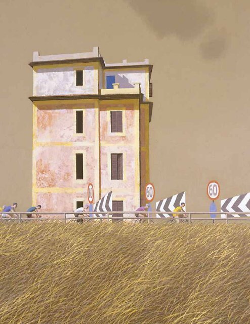
In Over the Hill, the Bicycle Race (1973), as in<br />
other celebrated <strong>Smart</strong> paintings such as Near<br />
Ponticino (1973), we are witness to a kind <strong>of</strong><br />
over-attentive foregrounding <strong>of</strong> road signs,<br />
markings and paraphernalia which is utterly<br />
discombobulating. <strong>The</strong> works are robbed <strong>of</strong> their<br />
logic, just as many <strong>of</strong> <strong>Smart</strong>’s roads are deprived<br />
<strong>of</strong> traffic to obey them. Although <strong>Smart</strong> has been<br />
publicly skeptical <strong>of</strong> abstract tendencies in art, we<br />
<strong>of</strong>ten end up seeing these signs not as function<br />
but as pure pattern, and visual rhythm. <strong>The</strong>y are<br />
heaped up, repeated, reflected to the point <strong>of</strong><br />
absurdity, but also <strong>of</strong> poetic beauty.<br />
bicycle rAces<br />
<strong>The</strong> bicycle also serves in <strong>Smart</strong>’s work to joyously<br />
trump the ‘system’ <strong>of</strong> the road. bicycle races close<br />
roads to traffic, robbing them <strong>of</strong> their quotidian<br />
purpose, staging sporting theatre on the site <strong>of</strong><br />
daily tedium. <strong>Smart</strong>’s love <strong>of</strong> the bicycle, as the<br />
vehicle <strong>of</strong> freedom, as far back as his boyhood in<br />
Adelaide, seems to have been extended and<br />
intensified in those Italian years in the ‘60s. As<br />
<strong>Smart</strong> settled in Italy, Gimondi and Anquetil fought<br />
it out on the Giro d’Italia and the bike was<br />
enshrined as a cult object, with the cyclists the<br />
Olympians <strong>of</strong> the road. In the bicycle paintings,<br />
however minimally the canvas is covered by the<br />
bicycle, its symbolic power as interrupter <strong>of</strong> road<br />
rhythms, the conqueror <strong>of</strong> the car culture, remains<br />
powerfully present.<br />
<strong>The</strong> most striking bicycle painting here is <strong>The</strong><br />
Bicycle Race III (1967), a work well known and <strong>of</strong>t<br />
analysed, especially since Peter Quartermaine’s<br />
publication <strong>of</strong> the photograph on which it was<br />
based in 1983. Notice the trademark colliding <strong>of</strong><br />
strong horizontals with elegant serpentine curves,<br />
the rhyming <strong>of</strong> riders with the architecture <strong>of</strong><br />
the road, the apparently gratuitous spheres in<br />
sync with the cyclists’ heads, as the arch <strong>of</strong> the<br />
backs echo the architecture <strong>of</strong> the bridge. <strong>The</strong><br />
structures that <strong>Smart</strong> creates with the three<br />
cyclists in foreground, middle ground and distance<br />
are so elegant that we forget that no pr<strong>of</strong>essional<br />
cyclist would allow himself to lose time by taking<br />
this bend so wide. A dominant feature <strong>of</strong> the<br />
painting is the quasi-heraldic advertising board<br />
displaying the logo <strong>of</strong> the Italian petrol and gas<br />
company, AGIP. <strong>Smart</strong> deliberately substituted<br />
this design classic (created in 1953, by the artist<br />
and sculptor Luigi broggini) for the the Campari<br />
hoarding we see in the photograph. Let’s look<br />
closely at the hoarding: the apparently incidental<br />
missing piece <strong>of</strong> the billboard is no mere reality<br />
effect. Not only does the missing rectangle<br />
paradoxically emphasise the strong rectangles<br />
<strong>of</strong> the upper half <strong>of</strong> the composition, more<br />
importantly, it is a symbolic token <strong>of</strong> a greater<br />
absence. This logo is known as the ‘six legged<br />
dog’, but the six legs, its principal attributes,<br />
are deliberately hidden from view by <strong>Smart</strong>’s<br />
manipulations <strong>of</strong> angles <strong>of</strong> view. <strong>The</strong> only six legs<br />
we can see in this image belong to the cyclists.<br />
Whether we choose to see this as witty play or<br />
some kind <strong>of</strong> nostalgic nod to an idyllic and ideal<br />
harmony <strong>of</strong> legs and wheels, it certainly attests<br />
not only to the intricate complexity <strong>of</strong> <strong>Smart</strong>’s<br />
formal thinking but to his wit and erudition.<br />
That wit is extended to absurdity in one <strong>of</strong> the<br />
oddest, most perplexing and surreal <strong>of</strong> all <strong>Smart</strong>’s<br />
works in this exhibition <strong>The</strong> Golf Links (1971).<br />
<strong>The</strong> painting’s incongruities are plainly obvious:<br />
the curves <strong>of</strong> the double bunker, the placement<br />
5
<strong>The</strong> Mutes 1963<br />
<strong>of</strong> the flag in the bunker and the bottle shaped<br />
signboard on the course, are all highly unlikely and<br />
impracticable. <strong>The</strong> bench and female spectator<br />
are even more out <strong>of</strong> place. Odder still, is the<br />
intricate ‘mosaic’ pattern on the billboard’s<br />
reverse, with fragments <strong>of</strong> statuary, modern<br />
Greek script, primary colours and the large ‘E.S’.<br />
Given <strong>Smart</strong>’s penchant for brilliant, allusive play<br />
with billboards, this painting can be read more<br />
than anything else as a wry, absurdist meditation<br />
on his art and its practitioners.<br />
the Mutes ANd the Art <strong>of</strong> pAiNtiNg<br />
When Diderot encountered the work <strong>of</strong> the great<br />
genre painter Chardin, after an absence from<br />
public display, he exclaimed, “Welcome back, great<br />
magician, with your mute compositions!” One<br />
might argue that part <strong>of</strong> <strong>Smart</strong>’s enduring appeal<br />
is that same sense <strong>of</strong> mute magic. In two works<br />
in this exhibition <strong>Smart</strong> makes muteness, and<br />
painting, a theme. It has long been his practice to<br />
exhibit studies alongside finished paintings. Such<br />
studies are not purely preparatory but are also<br />
‘alternative’ to the painting. In <strong>The</strong> Mutes (1963),<br />
the study makes the ambiguity <strong>of</strong> the location a<br />
key. Somewhere between a warehouse and studio,<br />
a large board/canvas leans up at right heavily<br />
graphically marked as if it were the ébauche for an<br />
abstract painting. Or is it simply randomly marked<br />
by scuffs? <strong>The</strong> domestic-scaled door adds to the<br />
6<br />
ambiguity. Within this we clearly perceive two<br />
young men, in close proximity, signing to each<br />
other. We are witness to intense communication<br />
but excluded from its precise content.<br />
<strong>Smart</strong> makes this the dilemma <strong>of</strong> our involvement<br />
with the finished painting, which smoothes out the<br />
graphic traces. <strong>The</strong> marks on the large boards/<br />
canvases are now much less pronounced, effaced<br />
even. Contrasts <strong>of</strong> light and shade dominate; the<br />
space is somehow more funnel-like, leading us,<br />
along with the newly-included wooden sticks, to<br />
the figures. At the same time the composition<br />
obscures our sense <strong>of</strong> the space, enclosing<br />
whatever sense-making we might wish to make<br />
within the logic <strong>of</strong> chiaroscuro. <strong>The</strong> figures are<br />
remoter, more sculptural, graver. Painting is a<br />
mute and difficult art, its beauties emerging from<br />
extraordinary effort and layers <strong>of</strong> deception,<br />
its revelations achieved by suppressions and<br />
effacements. This is what <strong>The</strong> Mutes speaks <strong>of</strong>.<br />
However tricky, <strong>The</strong> Mutes, painting is one <strong>of</strong><br />
the few which depicts a real intimacy, and indeed<br />
proximity, in both the <strong>University</strong>’s collection and in<br />
<strong>Smart</strong>’s wider oeuvre. It is one <strong>of</strong> the few paintings<br />
to depict two humans in intimate conversation<br />
rather than bartering, or locked in sinister, tawdry<br />
or apparently fruitless exchange. <strong>The</strong>re is a<br />
perceptible tenderness here that is certainly rare<br />
in a body <strong>of</strong> work <strong>of</strong>ten both humorous and slightly<br />
wicked in its treatment <strong>of</strong> human relationships.<br />
If <strong>The</strong> Mutes might be seen as a reflection on<br />
the painter’s art, so too might another work, the<br />
Study for <strong>The</strong> Traffic Reflector. Here again, <strong>Smart</strong><br />
expertly synthesises his street vocabulary with the<br />
precision <strong>of</strong> a genre painter chronicling reflections,<br />
mirrors and lettering. This strangely composed<br />
study is indebted to Van Eyck, Velazquez and<br />
Vermeer, and yet is modern. It is funny, not only in<br />
a boulevard way, (the man walking in the opposite<br />
direction to the senso unico sign is a humorous<br />
counterpoint) but because it plays with forms,<br />
colours, and illusion and makes cars reflective<br />
objects, not vehicles <strong>of</strong> an oppressive modernity.
<strong>The</strong> Bicycle Race III 1967<br />
the virgiliAN verge: smArt As<br />
pAstorAlist<br />
Road verges are usually scruffy places, <strong>of</strong>ten<br />
irregularly grown and unkempt. <strong>Smart</strong>’s verges are<br />
lushly inviting, <strong>of</strong>ten encompassing and s<strong>of</strong>tening,<br />
‘bedding’ the concrete and aluminium <strong>of</strong> road<br />
and sign. <strong>The</strong> lush grasses can also be dominant<br />
compositional elements, as in <strong>The</strong> Bicycle Race<br />
II (1967), in which one third <strong>of</strong> the canvas is<br />
taken up with them, swaying and rhyming with<br />
the movement <strong>of</strong> the bicycles and countering<br />
the signage arrows. If we remember how <strong>of</strong>ten<br />
<strong>Smart</strong> has posed seated, relaxing figures in such<br />
lush grass we might want to speculate that these<br />
verges are not simply compositional or colour<br />
expediencies, but signs <strong>of</strong> <strong>Smart</strong>’s smuggling <strong>of</strong><br />
certain poetic landscape allusions into the unlikely<br />
margins <strong>of</strong> his urban scenes. <strong>The</strong>se lush verges<br />
are one element <strong>of</strong> what might be called an urban<br />
pastoral. <strong>The</strong> locus ameonus, the bucolic glade <strong>of</strong><br />
tradition, is now brought into the city limits. We<br />
might even see this pastoral tradition transposed<br />
to the ro<strong>of</strong>top (as in Lunch Hour, where the city’s<br />
heights become an unlikely idyllic space). It might<br />
seem counter-intuitive to label <strong>Smart</strong> a pastoralist,<br />
but if we enlarge our vision <strong>of</strong> what pastoral might<br />
be, we might be prepared to accept that from<br />
his Virgilian haven in Tuscany, <strong>Smart</strong> sometimes<br />
paints the city with a pastoralist’s eye, rather than<br />
the angst-ridden sensibility <strong>of</strong> those, like Hopper,<br />
to whom he is <strong>of</strong>ten compared.<br />
As we see over and again in this exhibition, <strong>Smart</strong><br />
can make the everyday appear strange and<br />
beautiful, by the concerted act <strong>of</strong> looking and by<br />
his repeated and intense engagement with the<br />
forms <strong>of</strong> the familiar. This necessarily limited, but<br />
rich and diverse selection <strong>of</strong> <strong>Smart</strong>’s work, will,<br />
I hope encourage visitors not only to marvel at<br />
<strong>Smart</strong>’s extraordinary inventiveness and technical<br />
skill, but also to look at these familiar images anew<br />
and to meditate on how the mute art <strong>of</strong> painting<br />
works its elusive, deceptive and seductive magic.<br />
7
Work exhibited<br />
1 Lunch hour 1959<br />
oil on canvas<br />
46 x 76cm<br />
UA1976.33<br />
2 Study for <strong>The</strong> Traffic Reflector 1974<br />
oil on canvas<br />
39.6 x 46.0cm<br />
purchased 1976. Transferred from <strong>Sydney</strong><br />
College <strong>of</strong> Advanced Education 1990.<br />
UA1990.271<br />
3 Coogee Baths study 1961<br />
gouache and ink on card<br />
37.5 x 48.8cm<br />
UA1976.25<br />
4 Study for Coogee Baths 1961<br />
black ink on card<br />
18.2 x 26.5cm<br />
UA1976.35<br />
5 Coogee Baths – Winter 1962<br />
oil on canvas<br />
91 x 122cm<br />
UA1975.57<br />
6 Sunstrip Baths 1962-3<br />
oil on composition board<br />
77 x 69cm<br />
UA1976.43<br />
7 Sketch for <strong>The</strong> Mutes 1963<br />
gouache and pen on paper<br />
27.6 x 33.8cm<br />
UA1976.42<br />
8 <strong>The</strong> Mutes 1963<br />
oil on canvas on board<br />
68.5 x 81.0cm<br />
UA1976.42<br />
8<br />
9 <strong>The</strong> Bicycle Race II 1967<br />
oil on canvas<br />
80 x 70cm<br />
UA1976.55<br />
10 <strong>The</strong> Bicycle Race III 1967<br />
oil on canvas<br />
53.5 x 80.5cm<br />
UA1976.26<br />
11 <strong>The</strong> Bathing Boxes 1968-9<br />
oil on canvas<br />
91 x 73cm<br />
UA1976.30<br />
12 Approach to the EUR 1970<br />
oil on canvas<br />
60 x 92.5cm<br />
UA1976.34<br />
13 Morning At Savona 1976<br />
oil on canvas linen<br />
60 x 49.5cm<br />
donated by <strong>The</strong> Hon. Roderick P AO, QC<br />
through the Australian Government’s<br />
Cultural Gifts Program 2011<br />
UA2011.26<br />
14 <strong>The</strong> Golf Links 1971<br />
oil on canvas<br />
81 x 90cm<br />
UA1976.27<br />
15 Over the Hill, <strong>The</strong> Bicycle Race 1973<br />
oil on canvas<br />
100 x 134cm<br />
UA1976.28<br />
All works © <strong>Jeffrey</strong> <strong>Smart</strong><br />
All works <strong>University</strong> Art Collection<br />
All works donated through the Alan Richard Renshaw<br />
bequest 1976, unless otherwise noted
ACKNOWlEdGEMENTS<br />
I would like to thank all those who have made this exhibition possible at such short notice. First and foremost, Ann Stephen, Senior<br />
Curator <strong>of</strong> the <strong>University</strong> Art Gallery and Collections, for suggesting the possibility and being so supportive <strong>of</strong> the unlikely idea <strong>of</strong> a<br />
recently arrived british scholar <strong>of</strong> French painting curating a show on a contemporary Australian artist. Her colleagues Luke Parker<br />
and especially Hannah Kothe have worked so hard on all fronts to make the exhibition happen, and have been scrupulous readers<br />
and editors. Helen Ledbury was as patient and keen- eyed with the text as she was tolerant <strong>of</strong> me writing it. Pam bell provided<br />
wise advice and suggestions, and John Spencer facilitated access to material on <strong>Smart</strong> in the Schaeffer library with his customary<br />
intelligence and efficiency. At <strong>Sydney</strong> <strong>University</strong> Museums we would like to thank Julie Taylor and Alayne Alvis. Our thanks are also<br />
due to catalogue designer Peter Thorn, Australian Galleries director Stuart Purves and <strong>of</strong> most <strong>of</strong> the artist himself, <strong>Jeffrey</strong> <strong>Smart</strong>.<br />
public programs<br />
David Malouf: A conversation on <strong>Jeffrey</strong> <strong>Smart</strong><br />
Friday 7 October 6-7PM<br />
New Law building<br />
Dumb and <strong>Smart</strong>er: Eloquence and irony in <strong>Jeffrey</strong> <strong>Smart</strong><br />
Mark Ledbury, Power Pr<strong>of</strong>essor and exhibition curator<br />
Tuesday 18 October 12-1PM<br />
<strong>University</strong> Art Gallery<br />
Published in conjunction with the exhibition<br />
<strong>Jeffrey</strong> <strong>Smart</strong>: <strong>Unspoken</strong><br />
<strong>University</strong> Art Gallery<br />
<strong>The</strong> <strong>University</strong> <strong>of</strong> <strong>Sydney</strong><br />
2 October – 27 November 2011<br />
Exhibition curator: Mark Ledbury<br />
Editors: Luke Parker, Hannah Kothe and Ann Stephen<br />
© <strong>University</strong> Art Gallery and authors 2011<br />
This catalogue is copyright. Apart from any use permitted under the Copyright Act 1968 and<br />
subsequent amendments, no part may be reproduced, stored in a retrieval system or transmitted<br />
by any means or process whatsoever without the prior written permission <strong>of</strong> the publisher.<br />
All images are © Jeffery <strong>Smart</strong><br />
Design and print production: Peter Thorn<br />
Printed using Forestry Stewardship Council approved paper<br />
Published by <strong>University</strong> Art Gallery, <strong>The</strong> <strong>University</strong> <strong>of</strong> <strong>Sydney</strong><br />
National Library <strong>of</strong> Australia Cataloguing-in-Publication entry<br />
Author: Ledbury, Mark.<br />
Title: <strong>Jeffrey</strong> <strong>Smart</strong> : unspoken / Mark Ledbury ;<br />
editors: Hannah Kothe, Luke Parker, Ann Stephen.<br />
Edition: 1st ed.<br />
ISbN: 9781742102528 (pbk.)<br />
Subjects: <strong>Smart</strong>, <strong>Jeffrey</strong>, 1921—Exhibitions.<br />
Painting—Australia—20th century.<br />
Other Authors/Contributors:<br />
Kothe, Hannah.<br />
Parker, Luke.<br />
Stephen, Ann.<br />
<strong>University</strong> <strong>of</strong> <strong>Sydney</strong>. <strong>University</strong> Art Gallery.<br />
Dewey Number:<br />
759.994<br />
9
JEFFREy SMART: UNSPOKEN