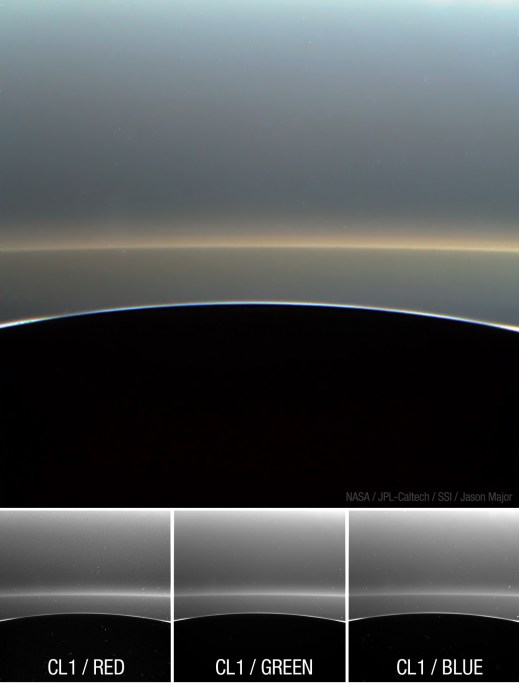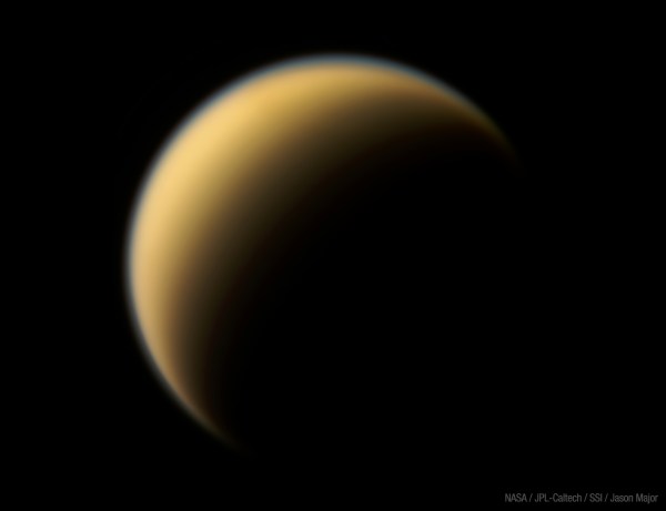
As you must certainly know by now, I love pictures of the many worlds of our Solar System. That is what I built this blog around and it’s what I’ve been mainly sharing here for the past eight years and counting. I particularly love the pictures of Saturn from NASA’s Cassini mission…really nothing exemplifies the beauty of the Solar System for me like majestic sweeping views of Saturn’s rings. And thanks to the modern marvel of The Internet these images have been made available to everyone, nearly as the same time as they are to the scientists on the mission team. This is true for many of NASA’s recent and current missions, not just Cassini, and there is a constantly-growing group of enthusiasts out there who take these raw images and create beautiful, full-color pictures from them, helping to bring the wonders of the Solar System to life.
There is a downside to doing this. The color images that are being produced by amateurs (including myself) are not usually calibrated to any specific standards. They are composed from preliminary, uncatalogued raw images. These usually—but not always—have been acquired in visible-light wavelengths, but even then the result isn’t necessarily an accurate representation of the colors you’d see if you were looking at the same scene from the viewpoint of the spacecraft.
There are a lot of reasons for this. Some are environmental—sunlight can be quite dim in the outer parts of the Solar System (it’s 100 times dimmer at Saturn!)—and some are technical; the spacecrafts’ cameras are sensitive to light in different ways than our eyes are (for actual science reasons) and all images have to have their exposures pre-planned to get the optimum results considering available lighting, distance to target, and relative velocities of the spacecraft and target(s). There’s a lot that has to happen right to get a successful image at all—it’s not like aiming your smartphone and pressing the big round button!
(Add to that a spacecraft like Cassini is using a camera that was built before cell phone cameras even existed—and while traveling tens of thousands of miles per hour. Most impressive.)
So the images that Cassini and most other recent spacecraft return to Earth are usually taken through specific filters, some of which correspond roughly to red, green, and blue wavelengths of light that our eyes can see. But even these look like black and white pictures until they are aligned on top of each other as close as they can be and stacked in the corresponding channels in an editing program like Photoshop…only then can a color version be seen. (You can find some great tutorials on raw image editing from The Planetary Society’s Emily Lakdawalla here.) From there, further edits can be made to color casts, contrast, saturation, etc….if the goal is something close to “real” color, I’ve always referred to previous calibrated “true color” images released by NASA and/or JPL. If the goal is something more artistic or dramatic, well…technically the data is public domain. You can create anything you wish (but then technically it would be “false” color.)

Personally I dislike the term false color, since that can carry a connotation (especially in today’s charged Trump-era news environment) of being maliciously faked. Scientists and image editors know what it means, but your average reader could misinterpret it as something different. I’ve tried a various terms to describe the color results I’ve gotten and really there’s no way to avoid at least some confusion; “approximate” and “uncalibrated” seem to be the safest routes.
Side note: of course the images aren’t “faked”—they are using actual pixel data captured by spacecraft millions if not billions of miles away! Yes, they are usually cleaned of random noise that typically occurs and the eye of the artist comes into play as well, but that’s the same with any of the hundreds of photographs that you see on a daily basis. Except for your most basic family party snapshots all images are post-processed in some fashion…if anything, the ones I and others (and NASA) share are far less manipulated than the typical commercial photo. (Trust me on that, I did plenty of commercial photo editing in previous jobs.) So unless you yell “fake” at basically every picture you see anywhere ever, please don’t do it to NASA’s images. It’s the same thing.
Also, as far as color accuracy goes, that is a nearly impossible target to hit. Even as close as you can get, using fine pixel calibration down to the specific wavelength of light captured, there will always be the factors of subjectivity by the individual viewer and the mode of display too. Ever go shopping for televisions or computer monitors? They can all be showing the same broadcast channel or sample image and they will all look slightly (or even not slightly) different! Which one is “real?” That’s very difficult to say. Which looks best? That’s completely up to you.
That’s not to say there’s no “right” and “wrong” though…there are many instances where what comes in from the spacecrafts’ cameras just isn’t correct. Again, there are reasons for that—one of which being that these cameras aren’t running in Auto mode like your point-and-shoot; rather, they have to be pre-programmed for exposure based on what scientists think they’ll need to get the shot in the wavelengths they want. That can result in over- or under-exposures of color channels in the raw data (images of Titan are a good example of this; the raws are usually much too bright in the blue channel) but that can easily be remedied in Photoshop. It might not be scientific but it can get results aesthetically very close to what it should be for that “true color” appearance.
If you’re patient then you could wait for calibrated raw data to be posted on NASA’s Planetary Data System (PDS), but that usually doesn’t happen for several months and the system isn’t really designed for casual users.

Now for science, researchers do need to know that the data they are looking at is as accurate and consistent as possible. That’s how they achieve their results and their groundbreaking findings can pass peer review; accuracy is imperative for science. But most of the images being shared by NASA and especially by amateur processors are not being used for actual scientific work; they are illustrative only. They are interpretations, meant to stir the imagination and build excitement about past, present, and future exploration missions—missions that would not be possible without public support and public funding. NASA does all that it does with just under half a penny on the dollar of taxpayer money; over the past couple of decades only about 0.5% of the U.S. federal budget yearly has been allocated to NASA. Building and maintaining citizen support is incredibly important, and pictures—even those that may be woefully unscientific as far as color accuracy is concerned—are on the front line of the continuing fight for public interest.
So why have “false color” at all? While the average person is mostly interested in what a scene would actually look like if they’d been standing there in person, scientists are much more concerned with things like composition, texture, and differences between regions large and small. These are often better highlighted when the range of light is expanded beyond what our limited eyesight would pick up. Pictures are great, but spacecraft also need to be much more than robotic tourists!
On the whole people appreciate science but they don’t always know how and why it’s done. In this matter, pictures really are worth 1.0 x 10³ words.
Why am I saying all of this? Recently I’ve been increasing my “productivity” on some of the images from Cassini, seeing that the mission will be coming to a dramatic end this September. (Sad face.) In addition to new data being acquired by Cassini during its Grand Finale final phase, I’ve been going through some older raw images and making color composites where the data is available, and sharing them on Twitter and Facebook. Others have been doing the same as well, and the collective interest has not gone unnoticed by media outlets who are on the lookout for pictures to illustrate the milestones of Cassini’s final few months in operation. As amateur processors are often “first responders” when new image data arrives on Earth, their (our) processed results are, although unofficial and uncalibrated, immediately available. Most outlets are very good at noting that the preliminary “social media” images were created by enthusiasts using raw data, but on occasion this fact isn’t heavily stressed. Unfortunately there are some members of the scientific community who take offense to that…even where none was intended. To those I say I’m sorry; there was never any desire to misrepresent or misinform the public in any way. I have never claimed that what I do is scientific work; it’s outreach, not research, and it’s all done on my own time and with my own resources (and also with data that is publicly available.) I do respect science and the work of scientists and the engineers who make it all possible; in reality I’m just a concerned bystander who wants to help spread the word as widely as I personally can.
And if doing that is somehow wrong, well… I don’t want to be right. 😉
In closing, thanks to everyone who has made the kind of images I share here on my little corner of the internet possible and also to those who have helped me and are still helping me get better at what I love to do. It’s a learning curve I’m still on, but luckily I love to learn. And for those who feel like I’m not doing it right or that I’ve somehow stepped on their toes, again: there really was no malice intended. It’s a big Universe and we really shouldn’t be fighting over the view.
No raw data was harmed in the production of this post.
PS: when all else fails, just remember to try not to be this guy:

This website exposes the flat earth deception and proves that the earth is globe shaped. This site discusses Earth maps which prove the earth is a globe.
http://earthmeasured.com
LikeLike
…
Terkirim dari Samsung Mobile.
LikeLike